Welcome to this website. My name is Thymen Sieval.

These product are the result of assignments about visualising and presenting concepts that were made up for these works. So the goal was not to design something functional, but to realize and present ideas, with restrictions on the materials that can be used. Many different techniques were used to do so. Apart from that we also had drawing courses in which we used our earlier products to rescale them by including the human scale (by for example adding trees, cars or people).
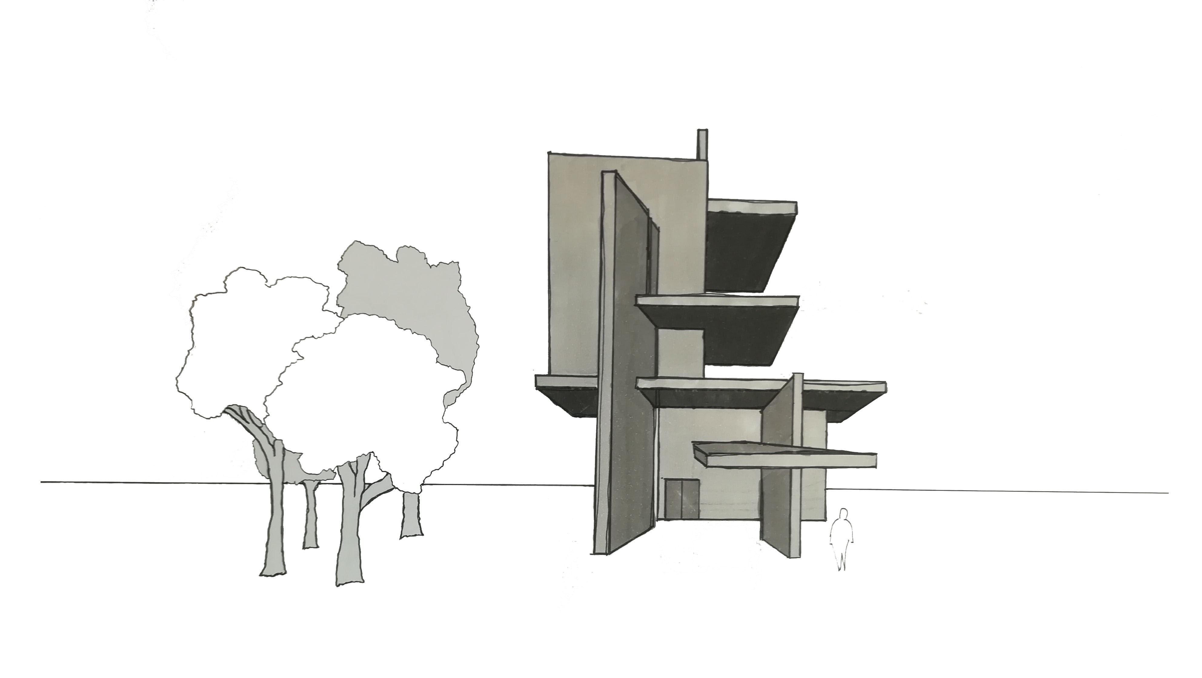
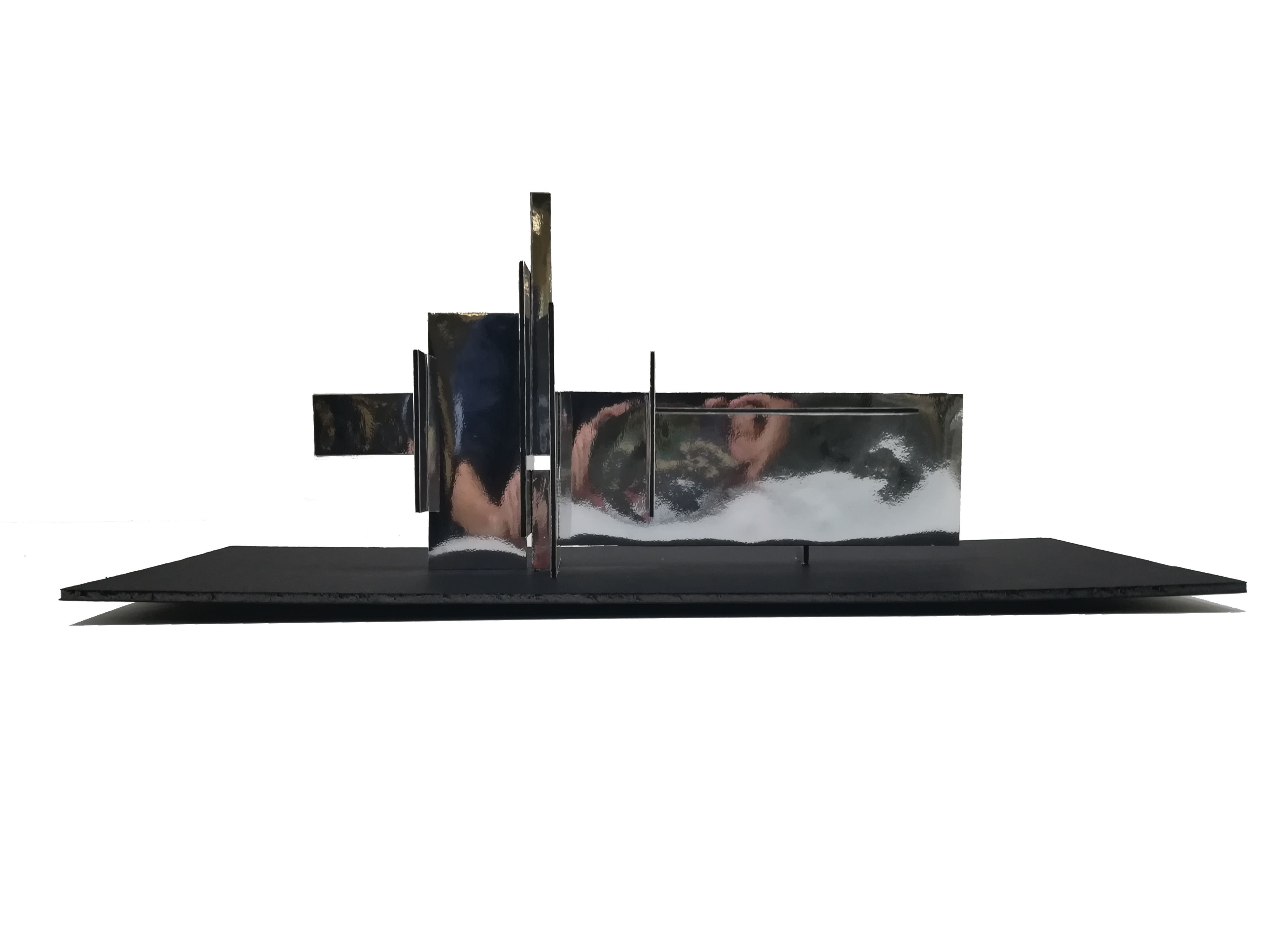
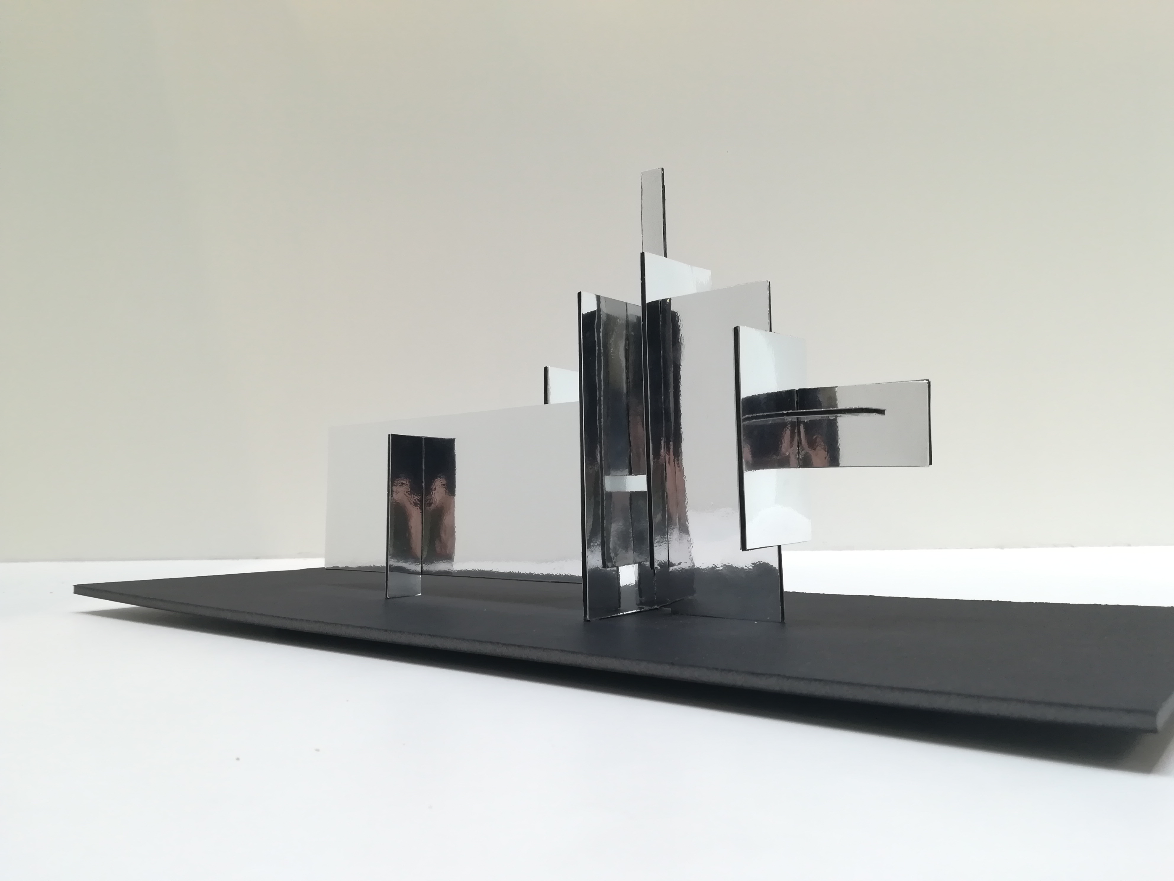
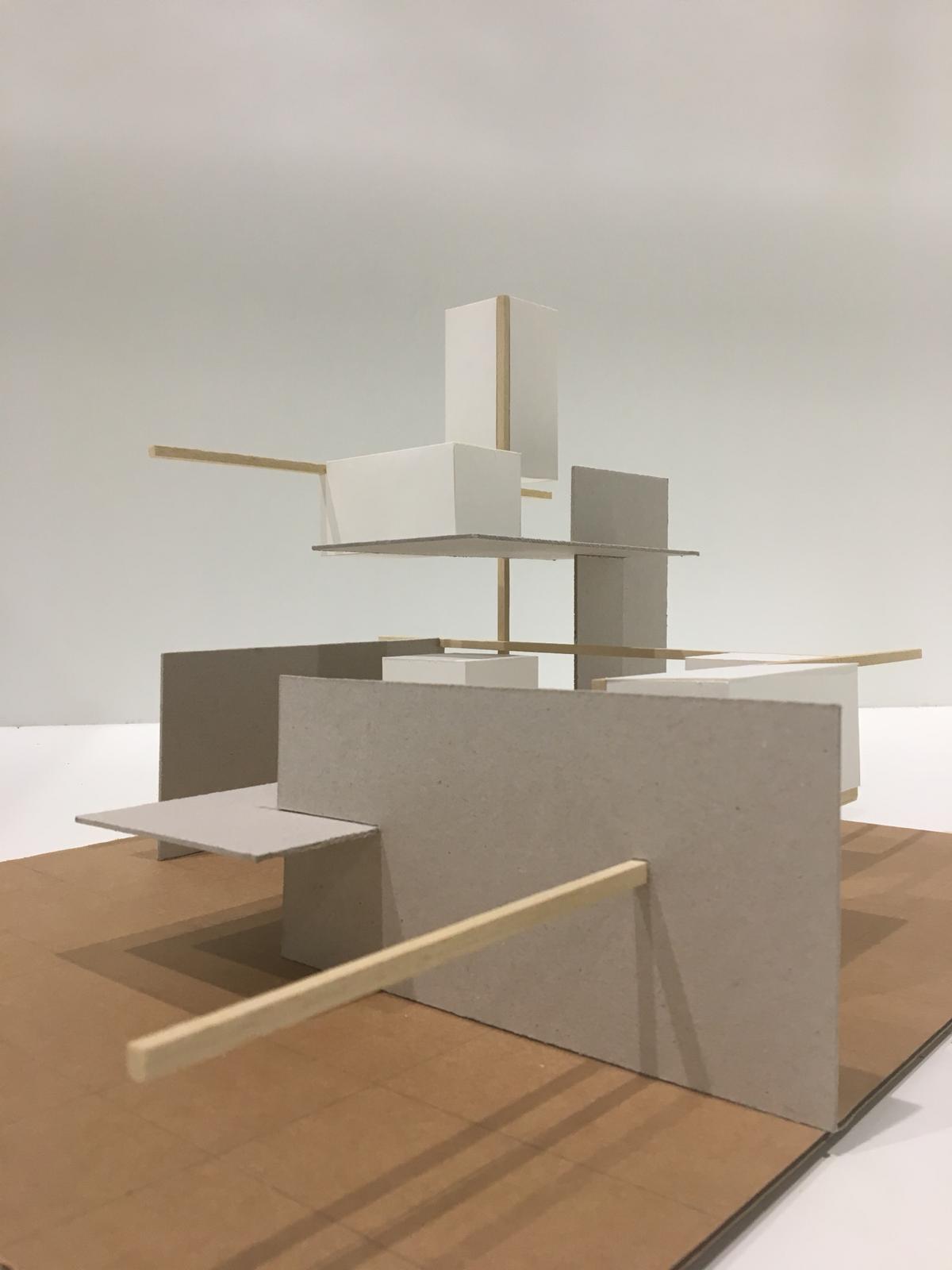
In this first assignment we had to make a composition of planes. By only using 9 boards of carton and small nails I had to demarcate directions and thereby creating a sense of place. As one can understand this was quite an abstracts assignment. Yet the creative freedom was endles. For my own work I have tried to divide the planes among my composition over the 3 axes. This was done on purpose because it increases the contrast and dynamics in all directions. I wanted to create as many different sized spaces as posible. To do so I tried to limited the use of planes to demarcate a space, by only three elements (one for every dimension). Furthermore I tried to realize an indirect diagonal contour.
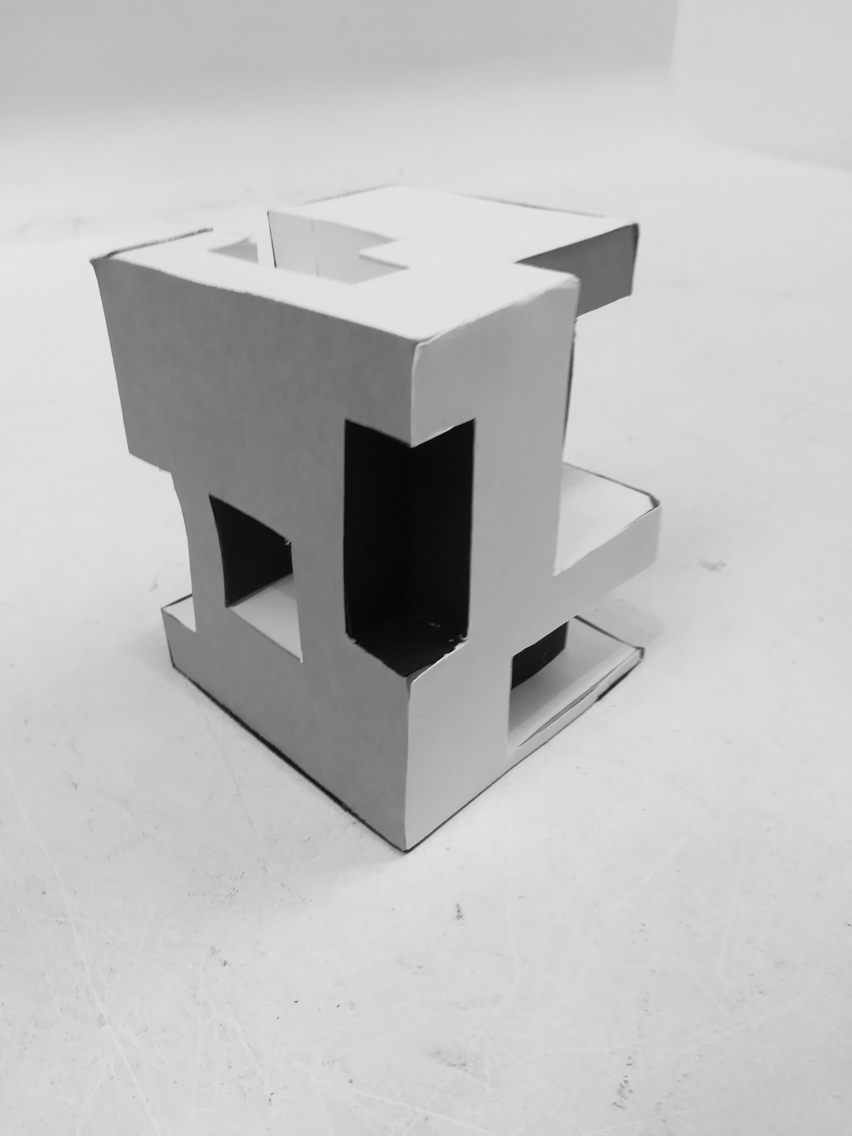
While in the first assignment spaces were create by demarcating "air", this second assignment was all about creating places by taking masses away from a block. To begin with, in my cube I wanted to have as many spaces through the core of the cube as possible, because in my opinion it makes people curious to see how this artifact is really put together. After making many sketches, I decided I wanted to have many corridors through the core. I didn't want the holes to end up on top of each other and distributed them irregularly across my cube. Then the idea arose idea to put together a viewing path through the cube arose. Furthermore, by positioning the corridors and removing other (smaller) masses at the outer edges, I tried to create an upward spiral through the cube. For the colors I wanted to increase contrast so every dimension got a different color. Furthermore, to put focuss on the inside I used white colors here, and darker colors on the outside.
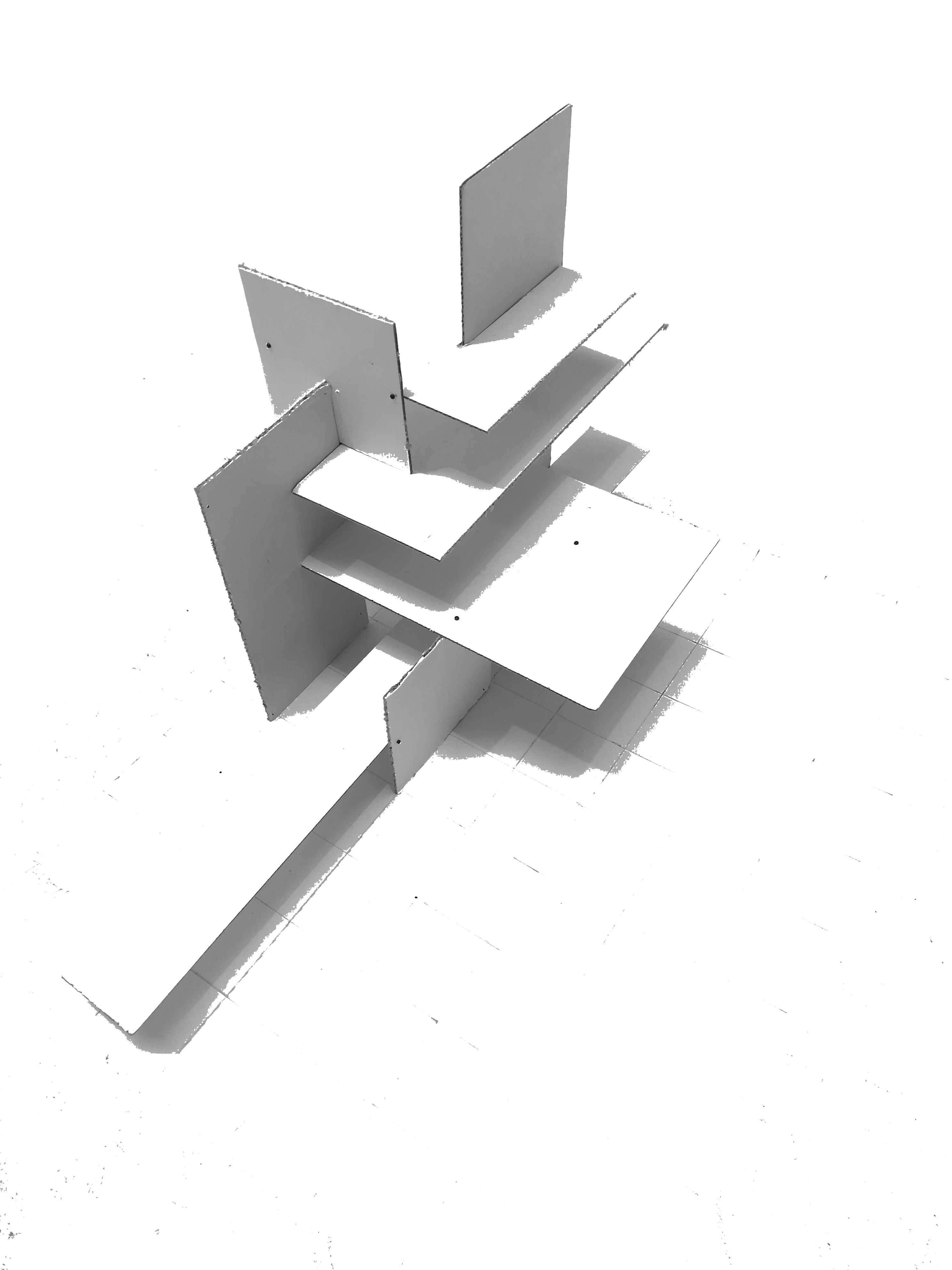
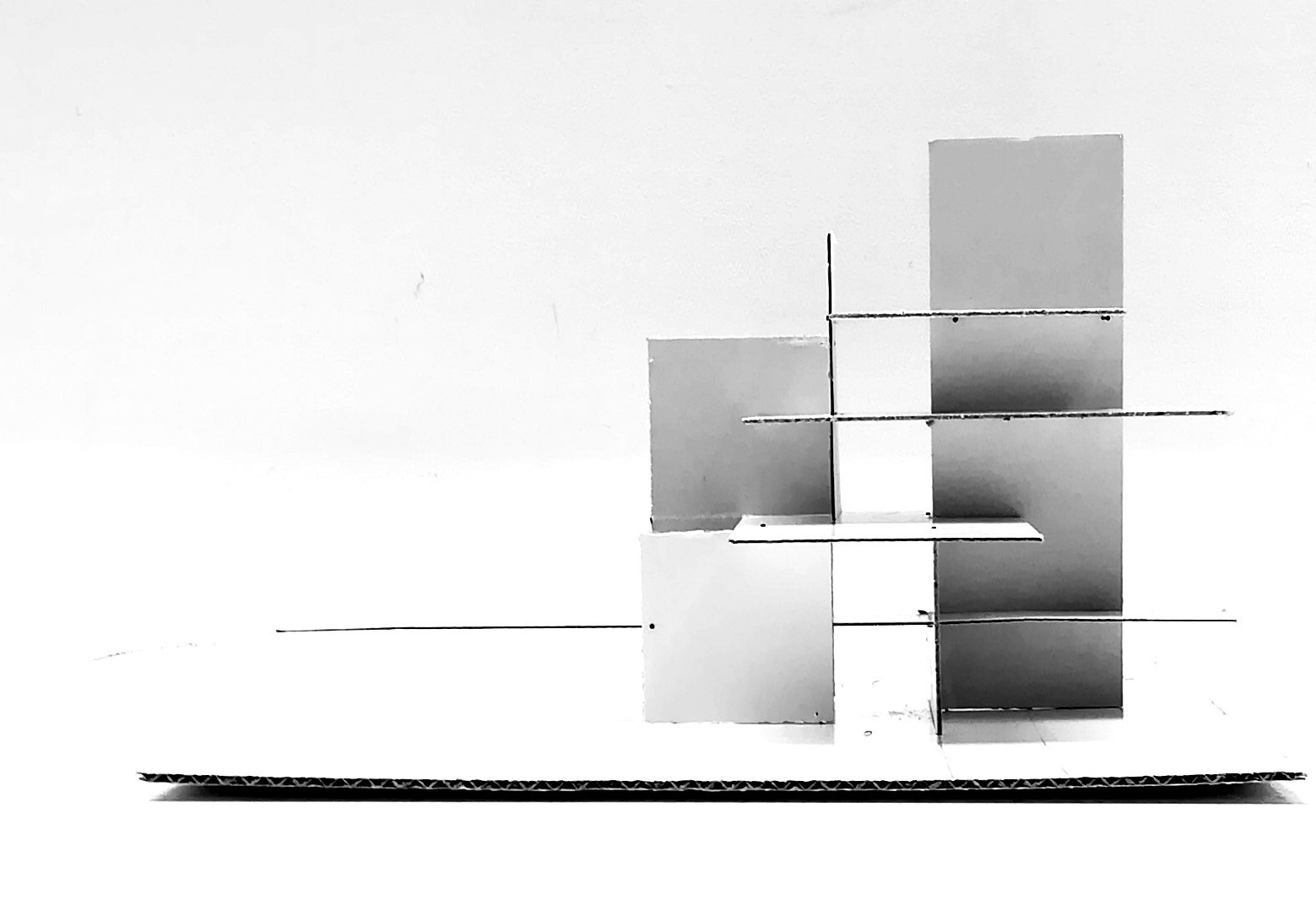
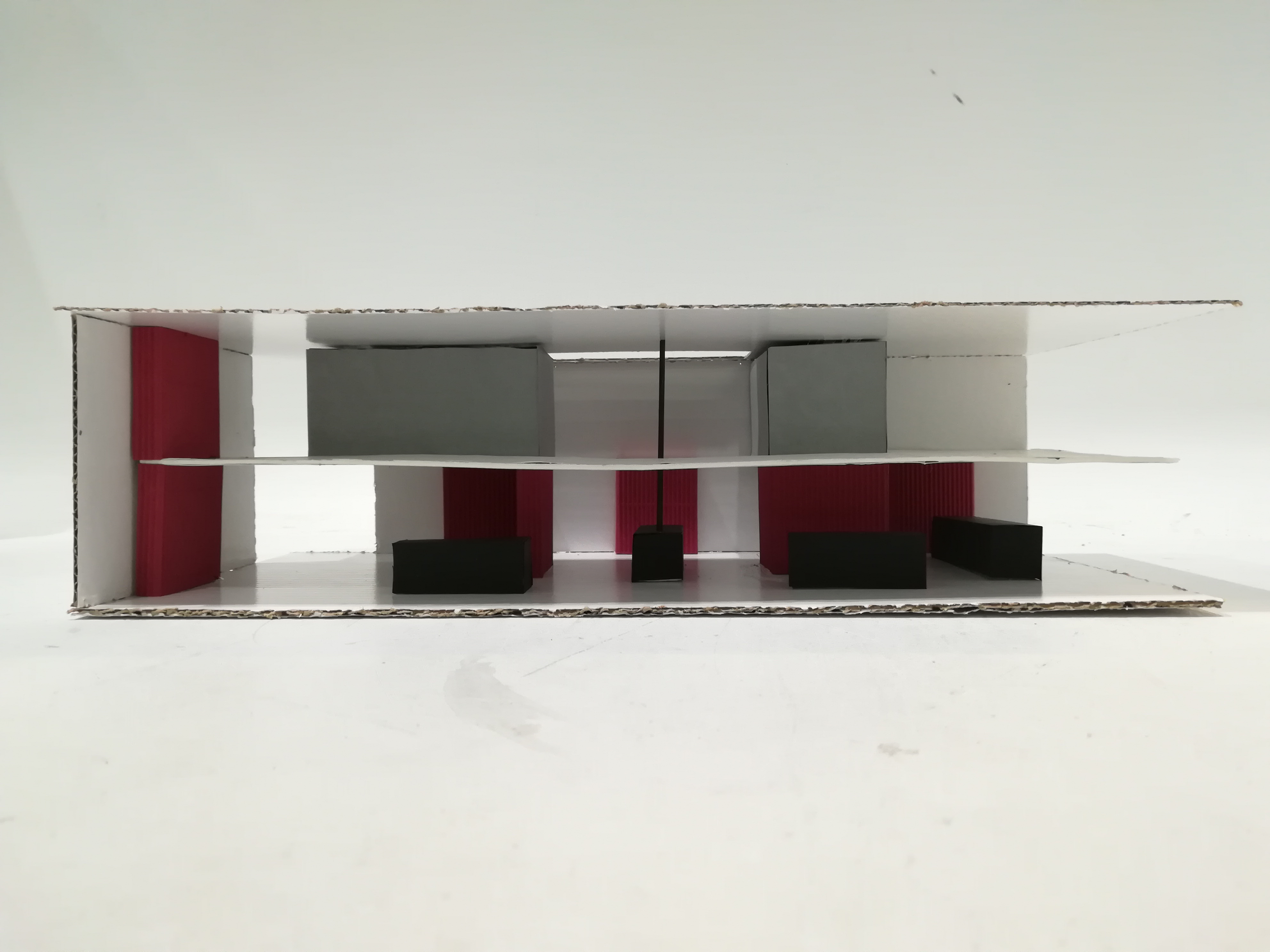
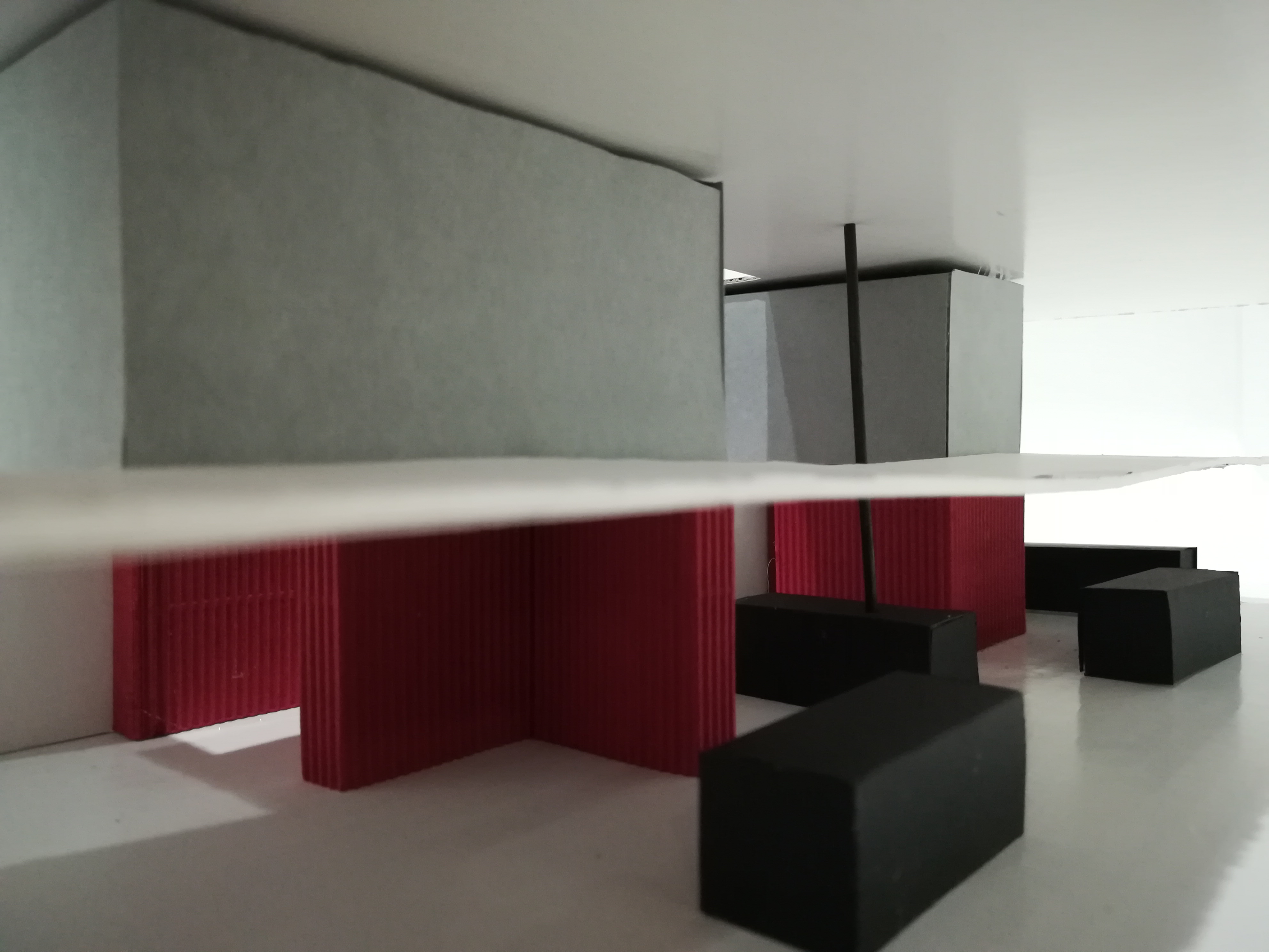
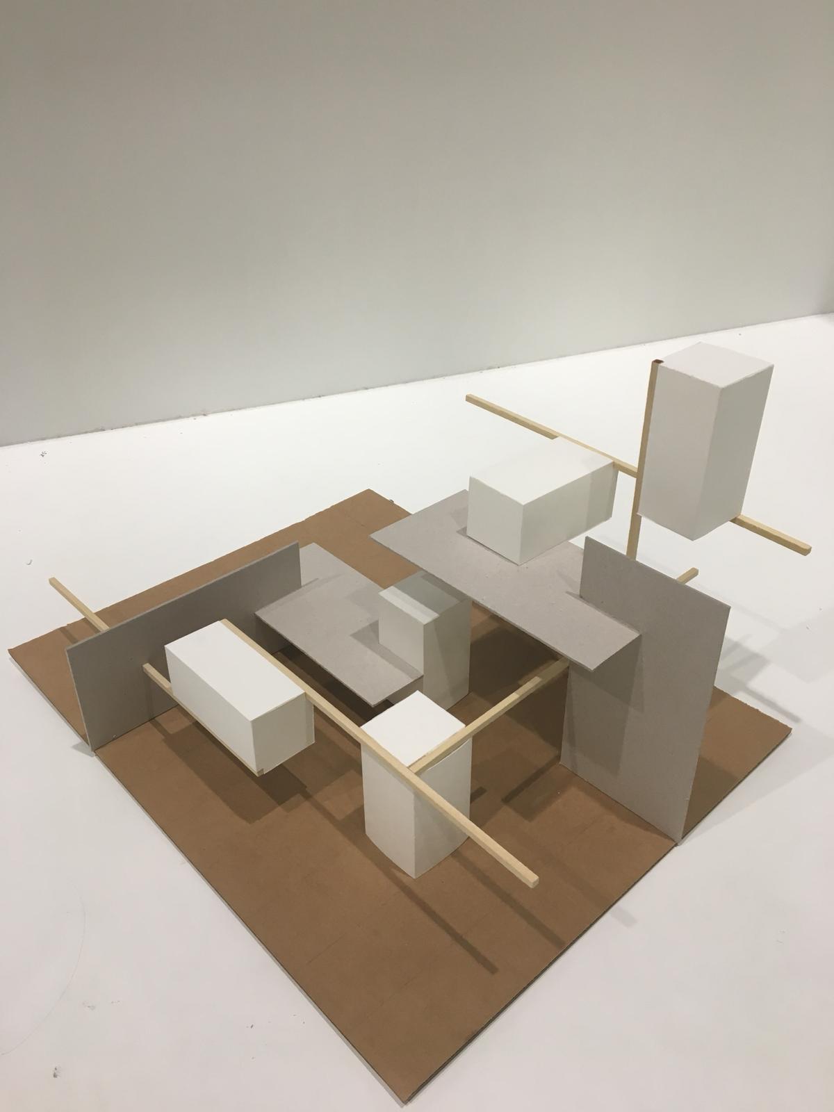
The assignment here was to conduct visual research into the relationship between form and counterform. We did this by setting up an interior space with place-defining, guiding and limiting elements. This allowed new spaces to be created. The masses respectively consisted of predetermined volumes. Before starting the assignment, it was already clear to me that I wanted an extra storey (loft) and a clear dividing line within the unity of my composition. One part of the interior had to be high and relatively enclosed, the other part lower and more open to the outside. In such a way also a boundary was created between some public space and a more private space. Finally, I then started looking at how the choice of tone could enhance the readability of the loft enhance it. Therefore, I chose to give the same objects entirely the same colour give them. To increase the contrast, I placed the black tables relatively close to the open side. The red cabinets against the white walls and put the grey spaces on the white upper space
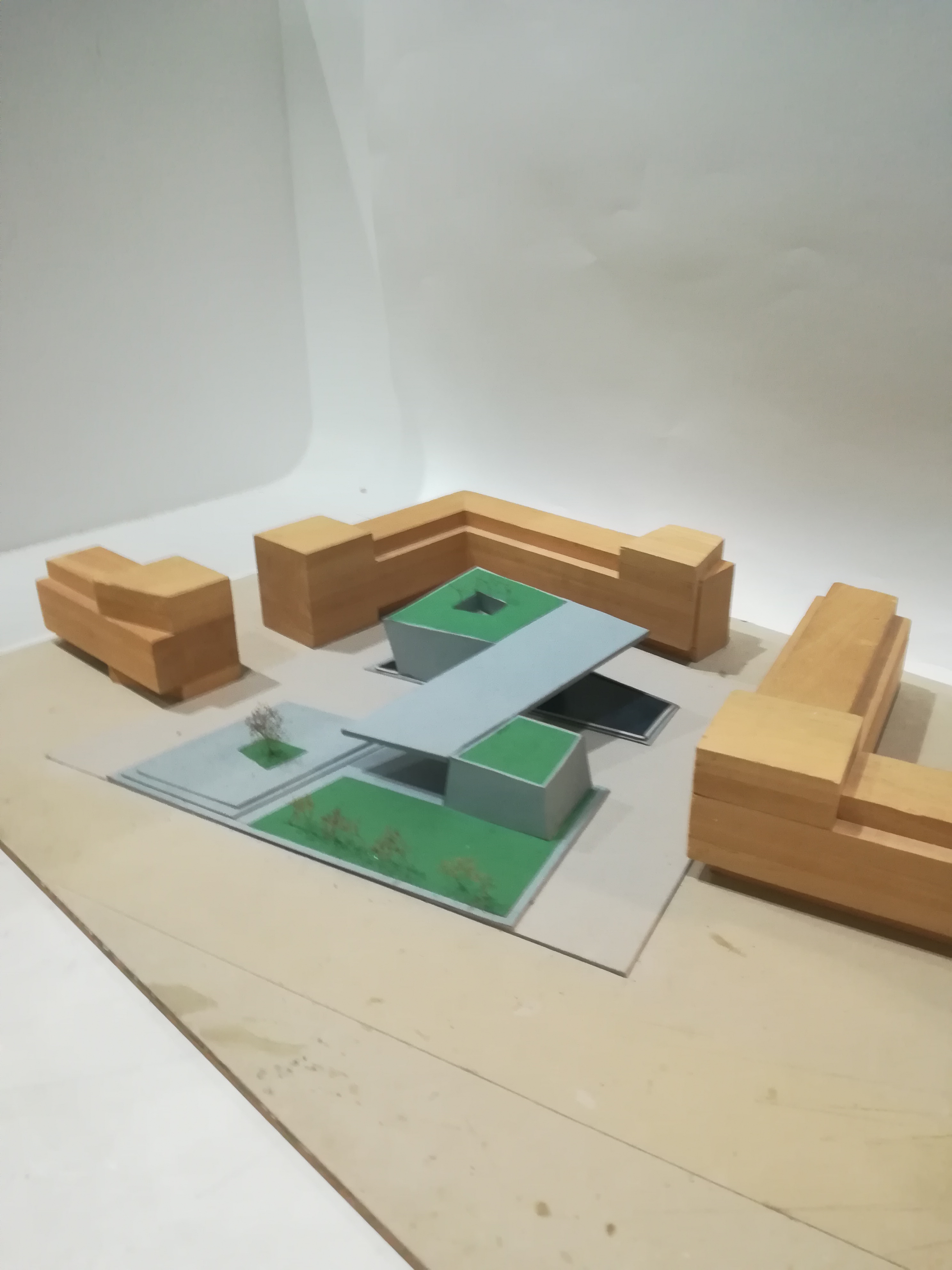
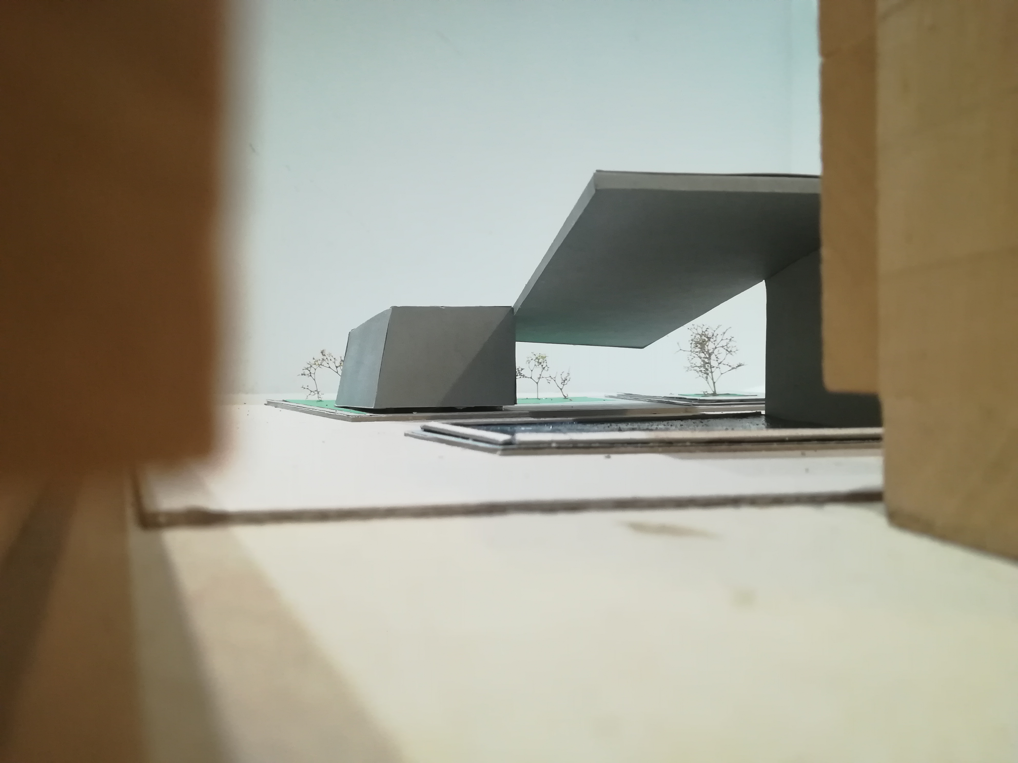
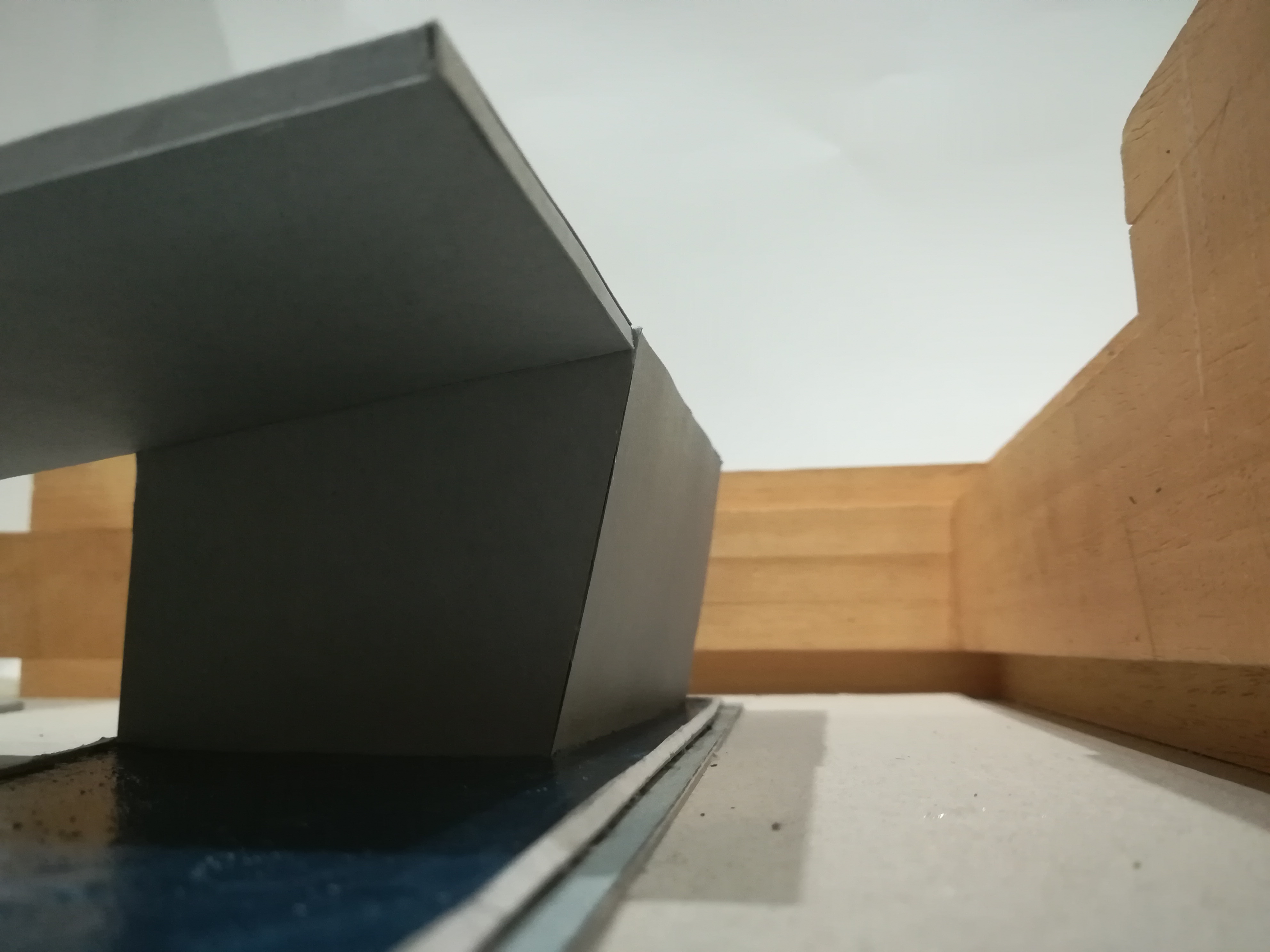
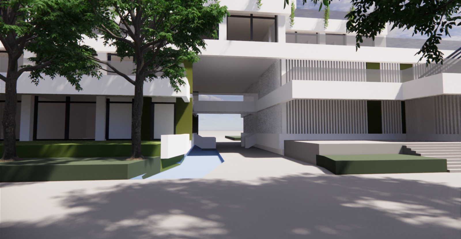
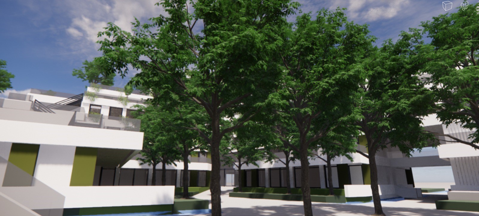
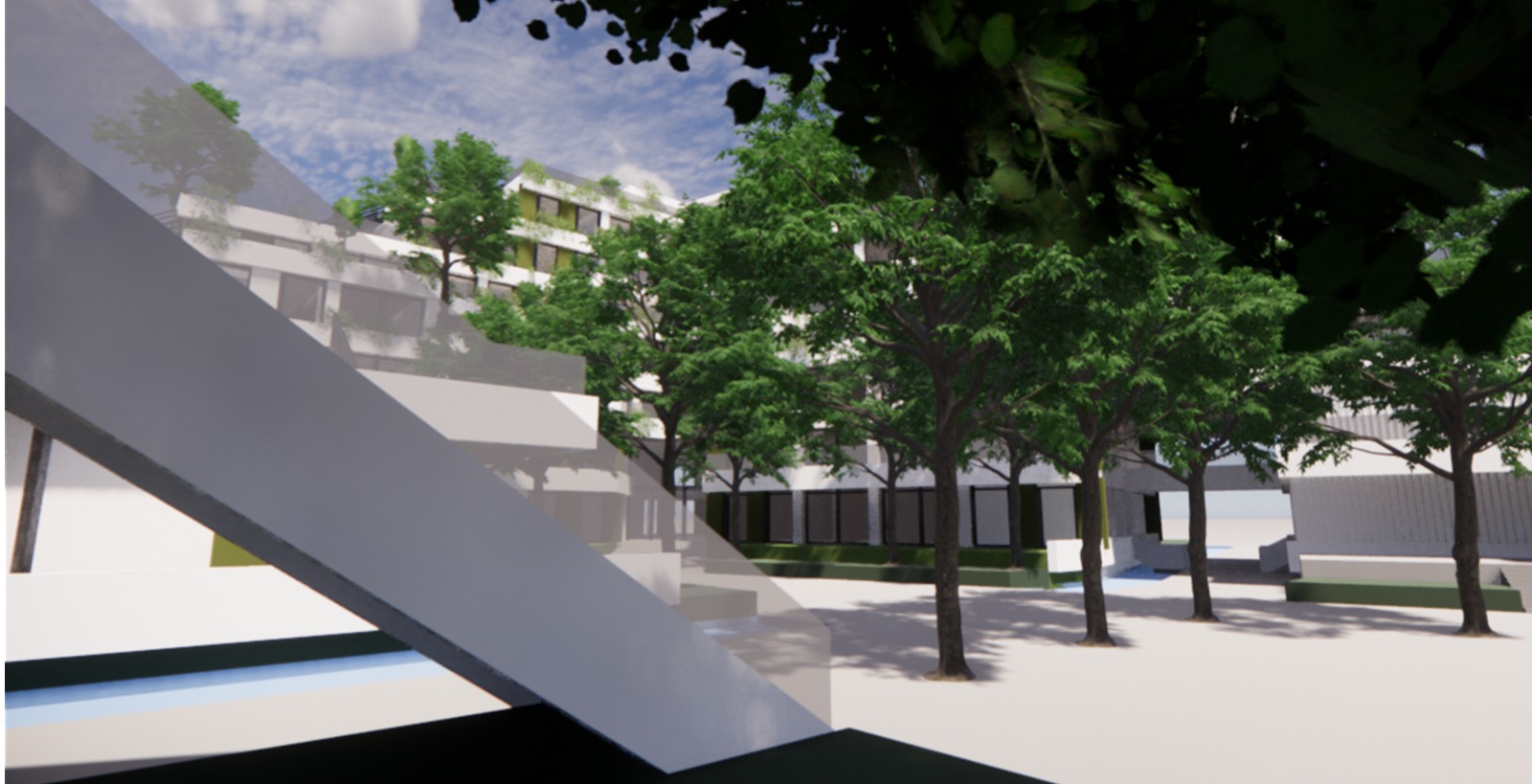
The brief given was to conduct visual research between form and counterform in a predefined space. Through the addition of colour, the composition was then materialised. The model had an urban planning scale of 1:200. The predefined defined space consisted of 3 building blocks of 6 storeys high. Passing through roads one could leave the square. The space that could be built on lay within the trapezoid formed by the 3 building blocks and a road on the open side. It struck me that in this assignment, the composition actually looms large and partly from the already placed building blocks. I spent a very long time thinking about the composition. But each time I wondered whether it would do most justice to the character of the square. This is actually how I arrived at the design that is there now. I tried as much as possible to follow the character of the square, but to add a playful variation and thus more dynamism to it by using the slopes of the masses and the mirror shape on the ground plane. In addition I noticed that when a building is placed in a pond it contrasts even more and thus enhances it form. With this last assignment the first course was finalized. As one can seen during the course the complexity and creative freedom increased over time. This process was continued in the second course (OV2)
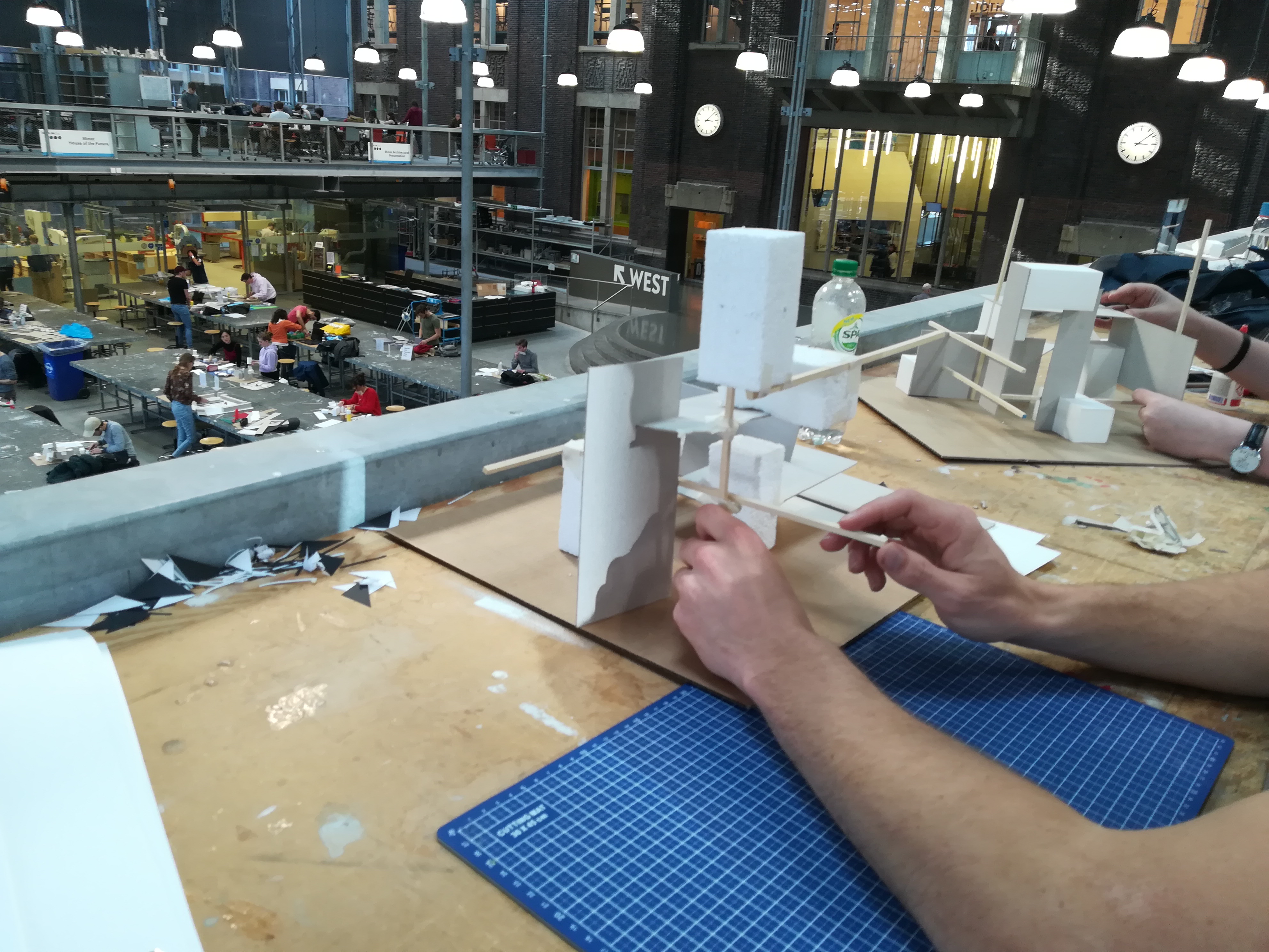
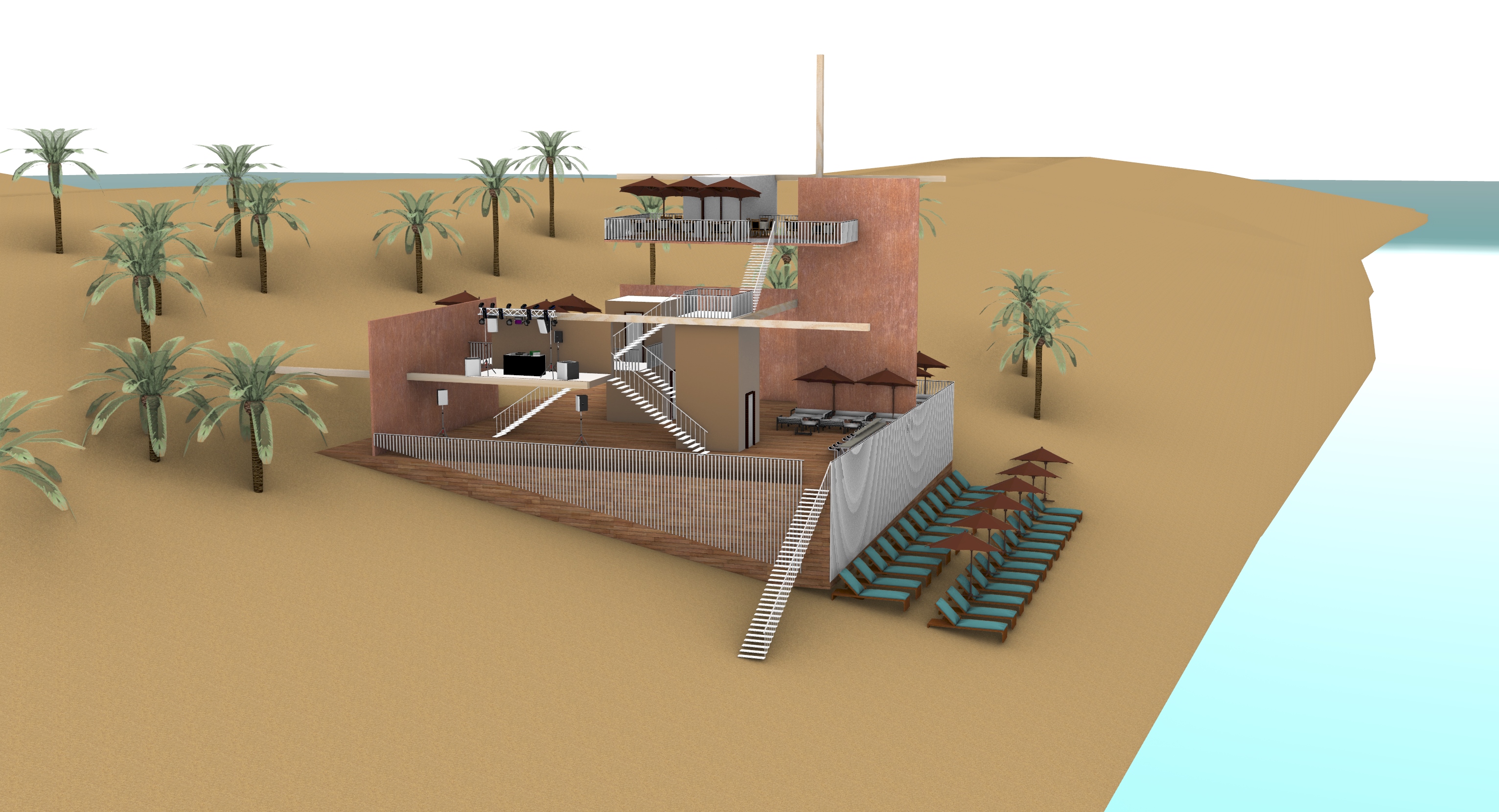
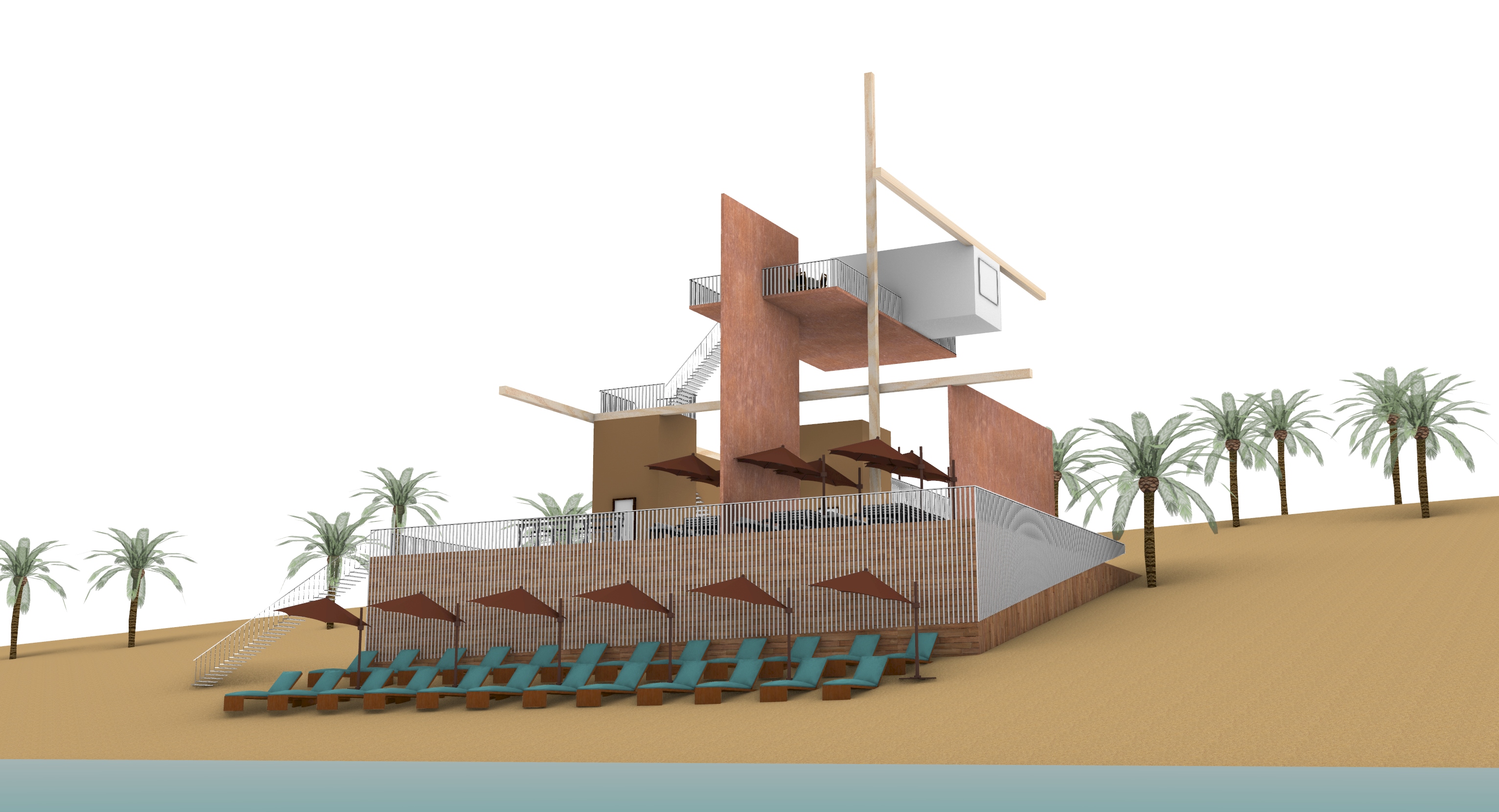
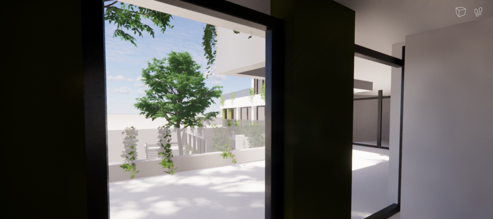
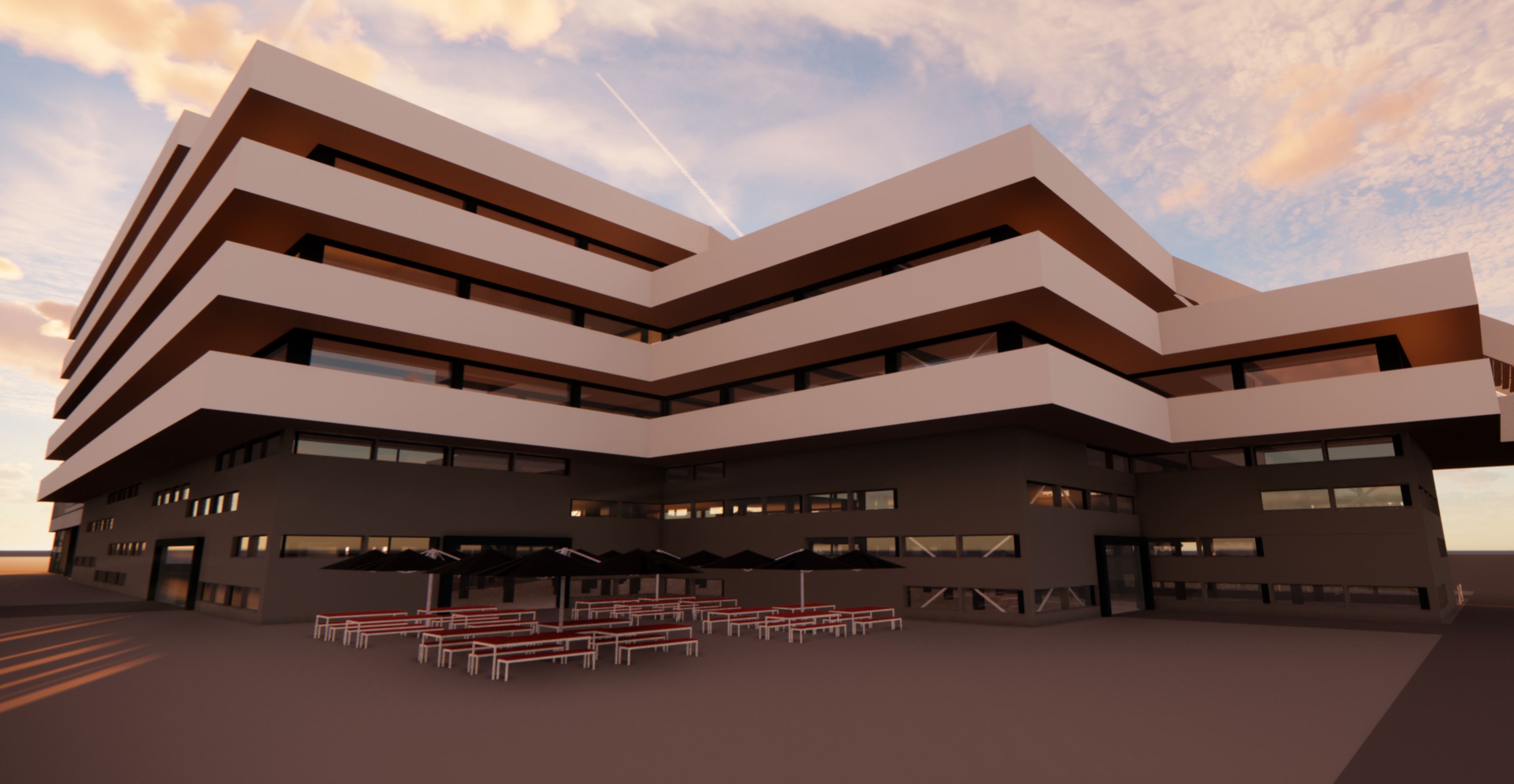
These assignments continued the work of the previous assignments, however, here more materials were provided which increased the creative freedom. In special students were asked to take one of their assignments and translate it into a digital designed (rhino) real-life sized object. I choose to make a beachclub.
In this assignment the materials of the construction were basically free to choose and compose. Each material has a different colour and texture with a specific effect on the space formed. Again, constructing the connections of the different elements was an important theme, but this time the assignment was particularly concerned about the detail and the (degree of) expression of it. The way in which that connection is then executed, however small in size, is often a determining factor the image of the construction. The main theme, which I have used in determine detail and expression in this composition, is the particular contrast of colour and material. For instance, a mirrored surface is often thin and of light colour, rather than thick and dark (like the volume in the composition). In contrast, the slabs (wall and floor) are detailed with white rough surfaces with much detailing in the thin side rather than in the large plane. The linear elements form a transition between these elements In addition, I like a composition with minimalist looks. A seamless and light connection between the different elements. Since in practice connections between materials are often being articulated by extra volumes imposed from a constructive point of view. Yet, in my composition I tried to keep the connections as "clean" as possible. This can especially be seen in the (seamless) cube.
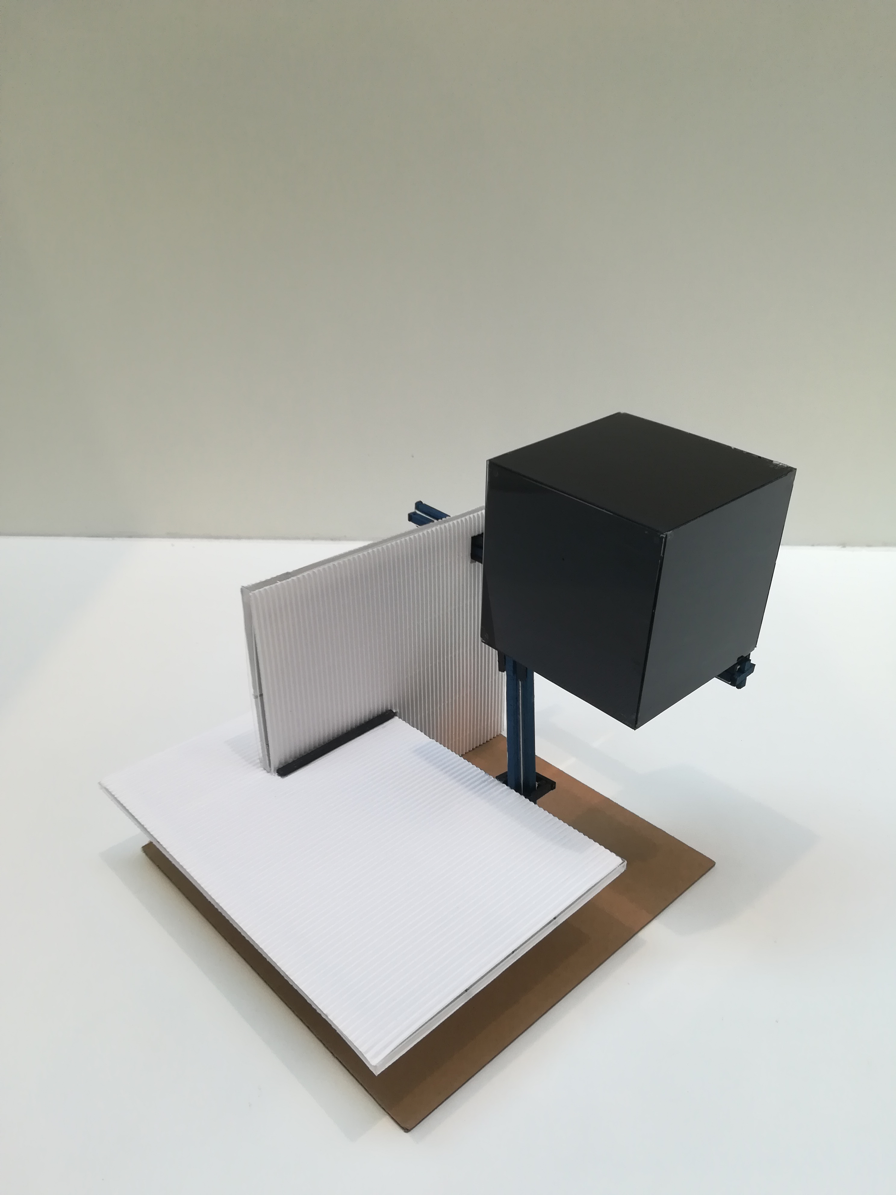
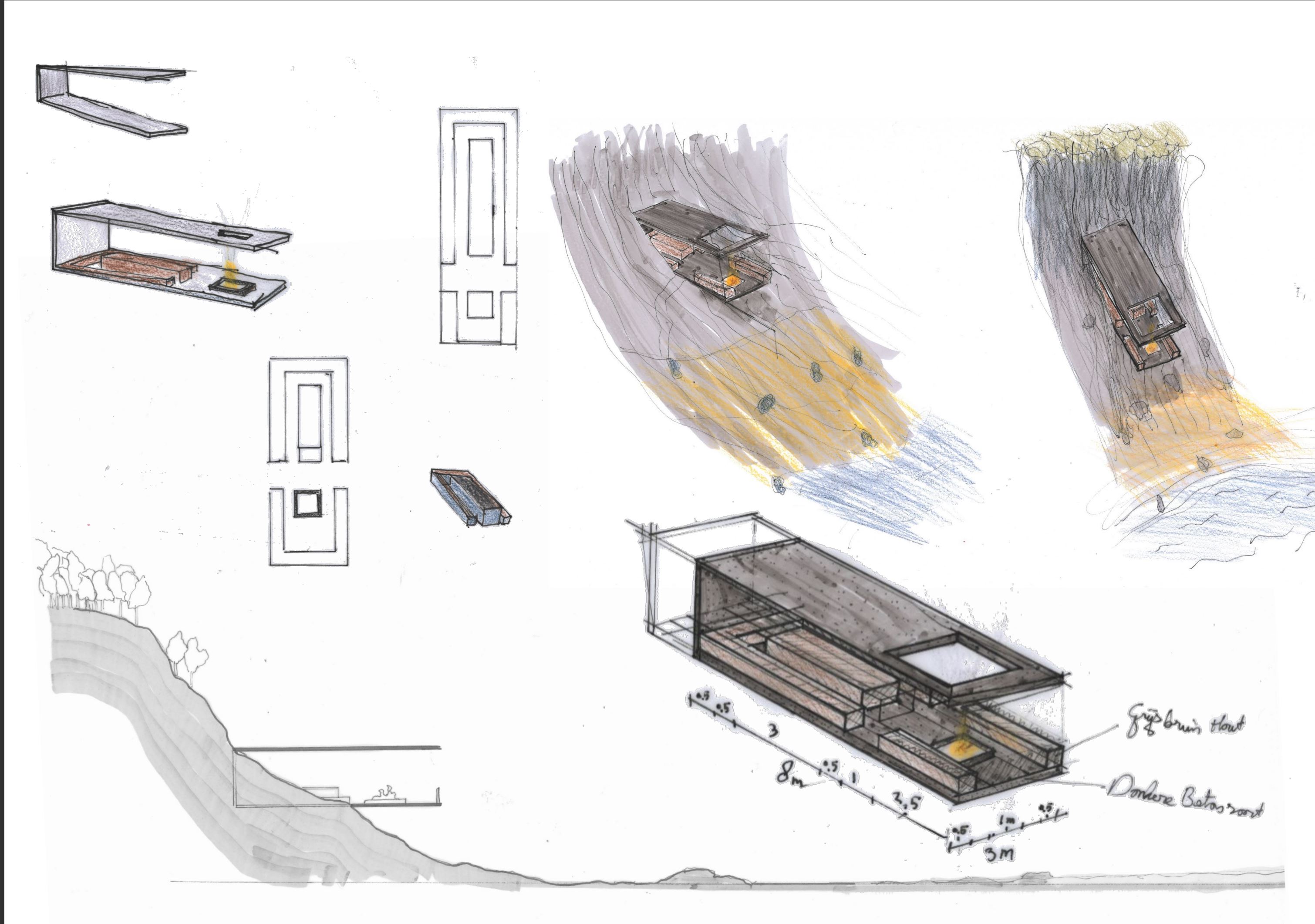
This time, the assignment for us was to delve specifically into the wall (as part of spatial compositions. The construction and materialisation of this were to be individually fill in. In particular, we were instructed to make designing the wall to make use of Fibonacci's series. As there are numerous possibilities for constructing the wall to construct, I started by drawing up a number of principles that I wanted to reflect in my design. For example, I wanted a wall that had a lot of mass at its core, becoming lighter and smaller towards the outside lighter and smaller so as to radiate a certain masslessness. In addition, I wanted a wall with a passage from one side to the other and I wanted like a staggered wall because these both create a lot of dynamics and curiosity curiosity. In addition, I thought it would be nice to use Fibonacci's size system in such a way that emphasise the verticality at this core and at the ends the horizontality. I tried to do this in such a way that even in the views a form of the golden ratio would be visible in the views. In terms of materialization, I tried to look for a rare material, in terms of color, reflection, and structure. In doing so, I found the contrast between the surface of the planes (reflecting) and there sides (black) This argument also made me decide to construct the base plate in matt black.
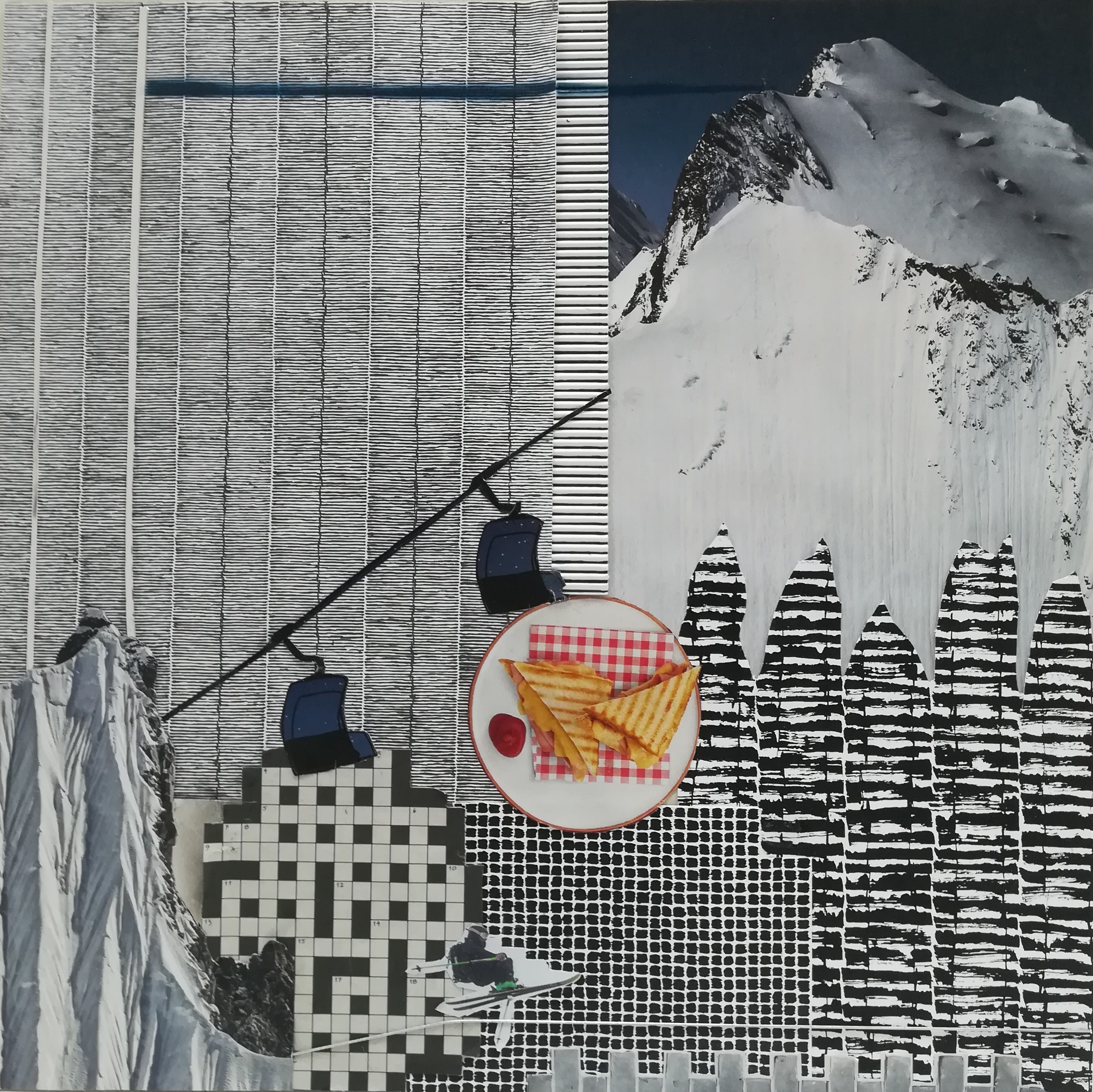
The assignment was to make 3 drawings by artist Jan Schoonhoven, relate to one another in a collage. Actually, this was the assignment in which we were able to combine all the knowledge of the past lessons and use it in a slightly different set-up. By using the different patterns, contrasts and coherences of materials provided we could reinforce or rather connect them. I started searching through the many magazines I had brought with me. After time, I had found enough images that fitted a theme but also had similar patterns and use of colour. The lines of the patterns are clearly replicated by the images from the magazines. By then cutting these out in a handy way and thus combining them, it was it was possible to relate the whole to each other. The round shape at the bottom center was a nice addition, giving an innovative look to the collage, although it does fit well in the circular orbit of structures that the collage features.
.jpeg)
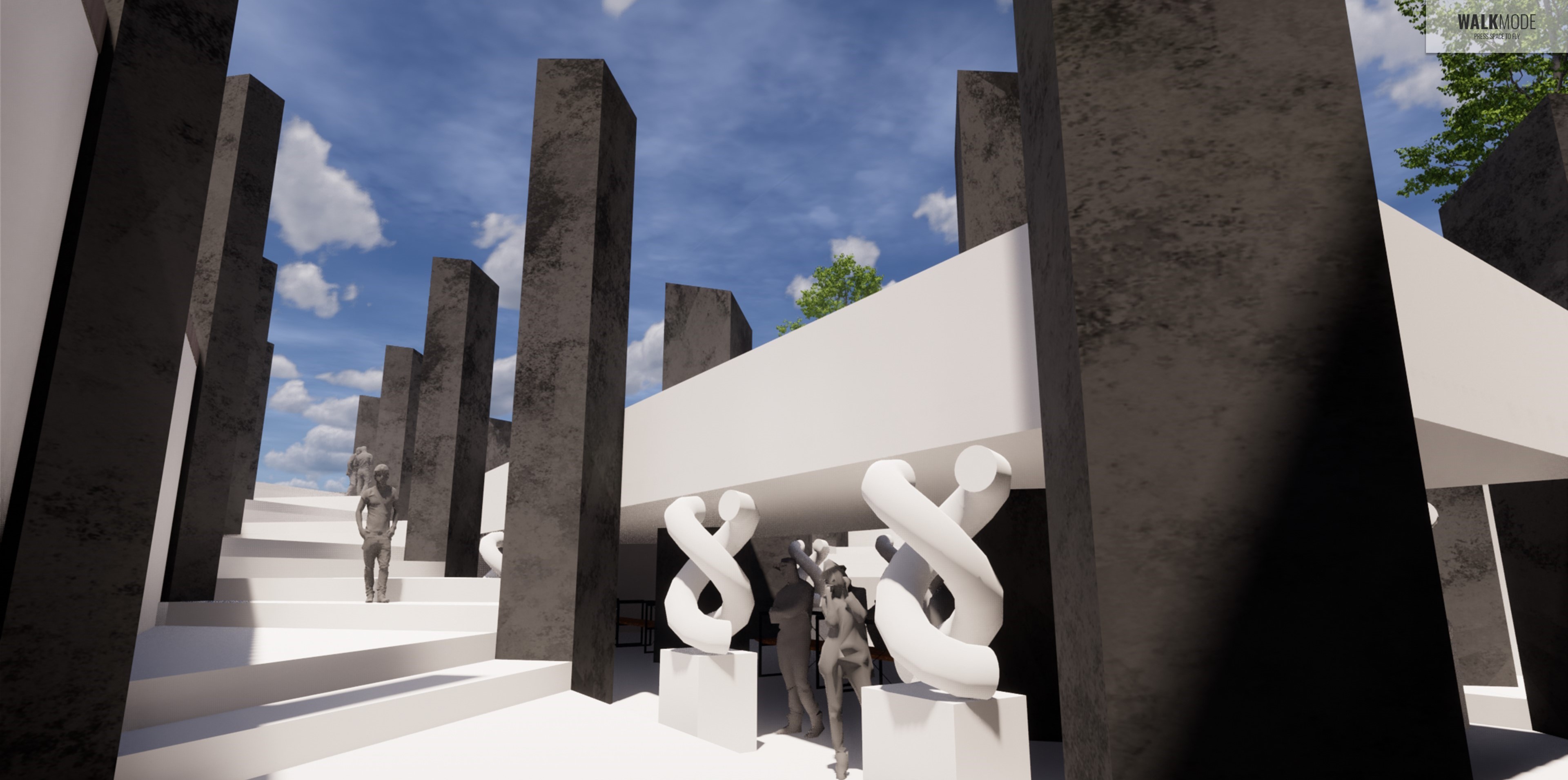
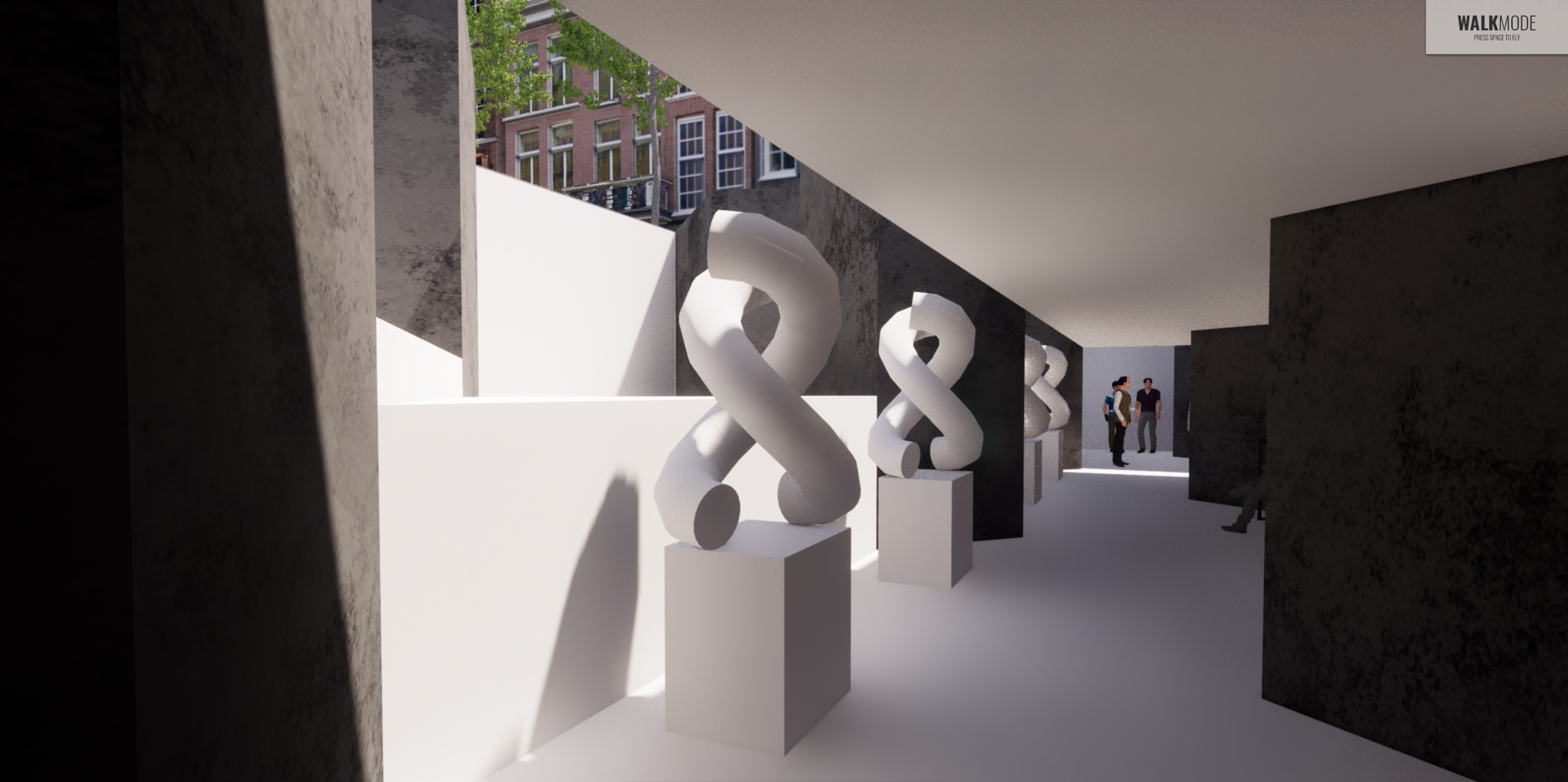
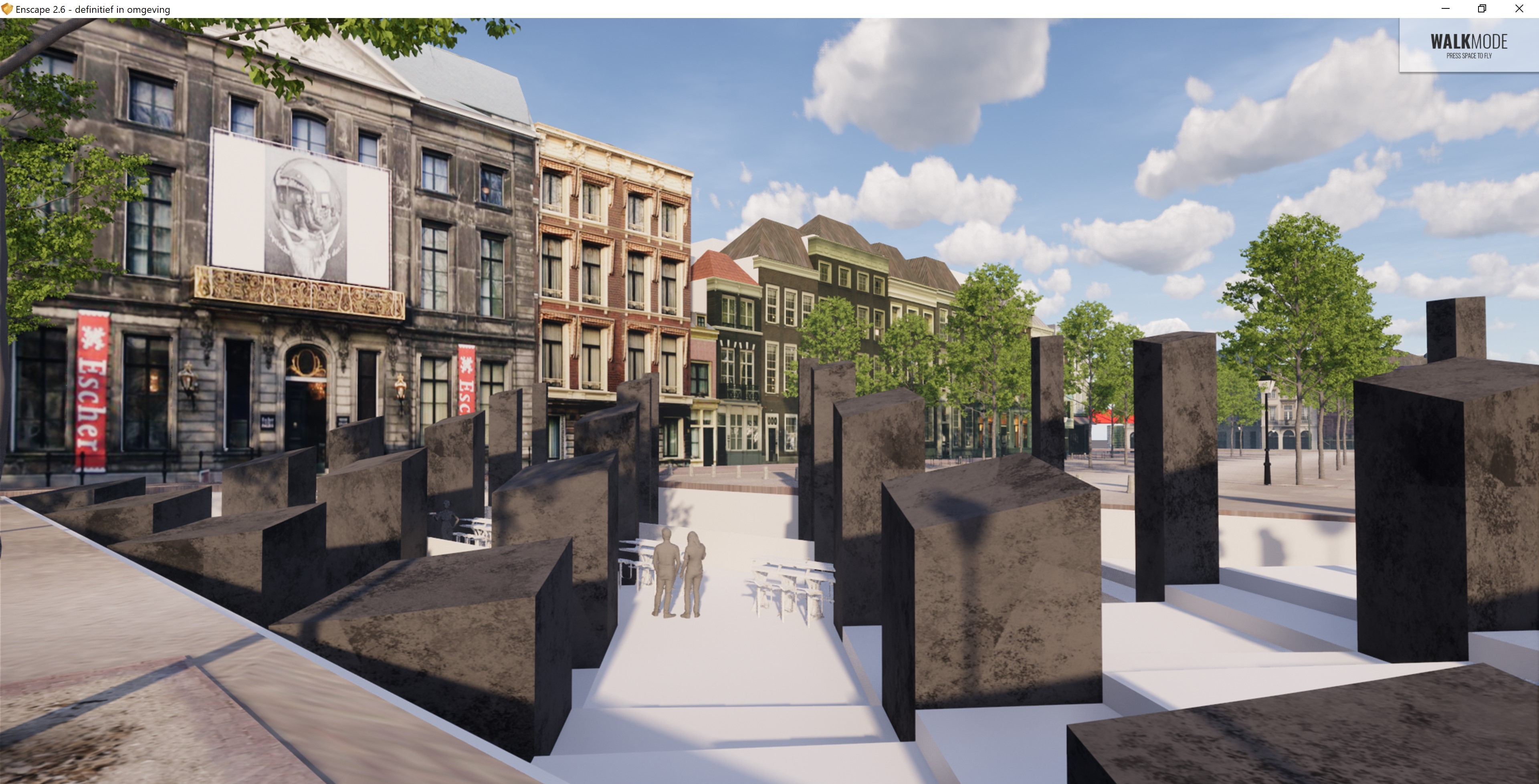
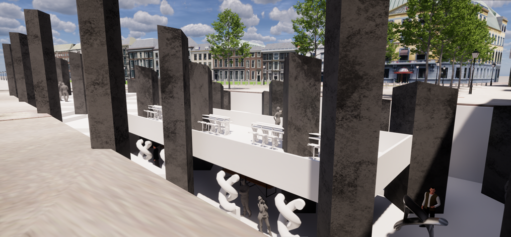
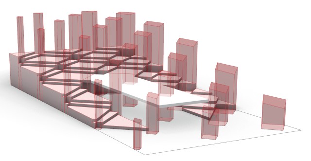
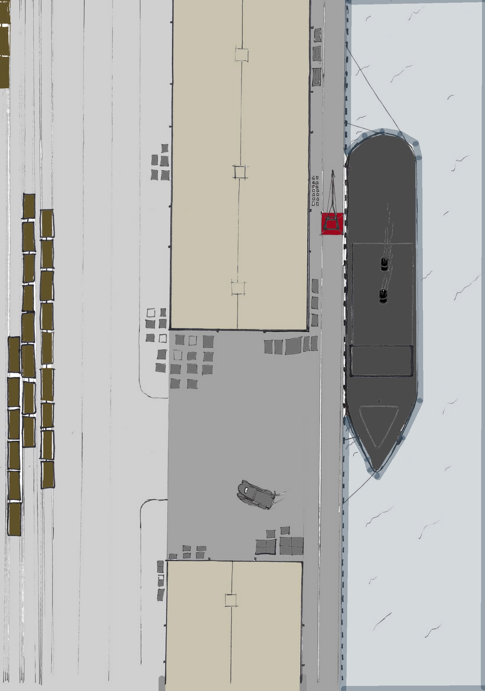
The OV3 course took a different approach. Altough the products from the previous courses guided as an input for this course, this course was fully digital. The main assignment was to create a parametric model (in rhino and grasshopper), to design an exhibition for a sunken museum (Esher) square. Important steps in my design process were the formulation of formulas for the dimensions of the masses and the height of the terrace. For the spatial composition, and hence sightlines, the amount of natural light was the most important guiding theme in this design. I wanted to give visitors a unique spatial experiences that different when one walks trough it. As if one walks trough a real life sized esher artwork. On top the design temps people to have a drink on the terras and have a look what is down there, halfway people really experience the spatial structure and on the lowest level people can visit the exhibition itself. Thereby the natural lighting creates extra emphasis on the artworks themselves.
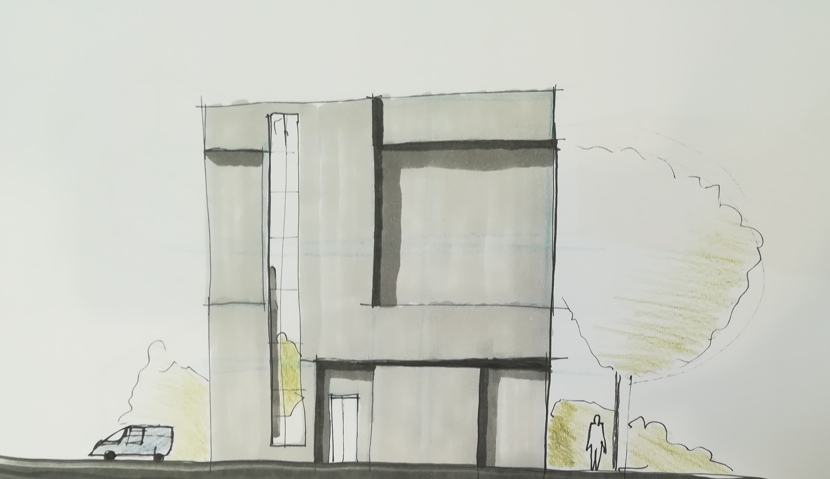
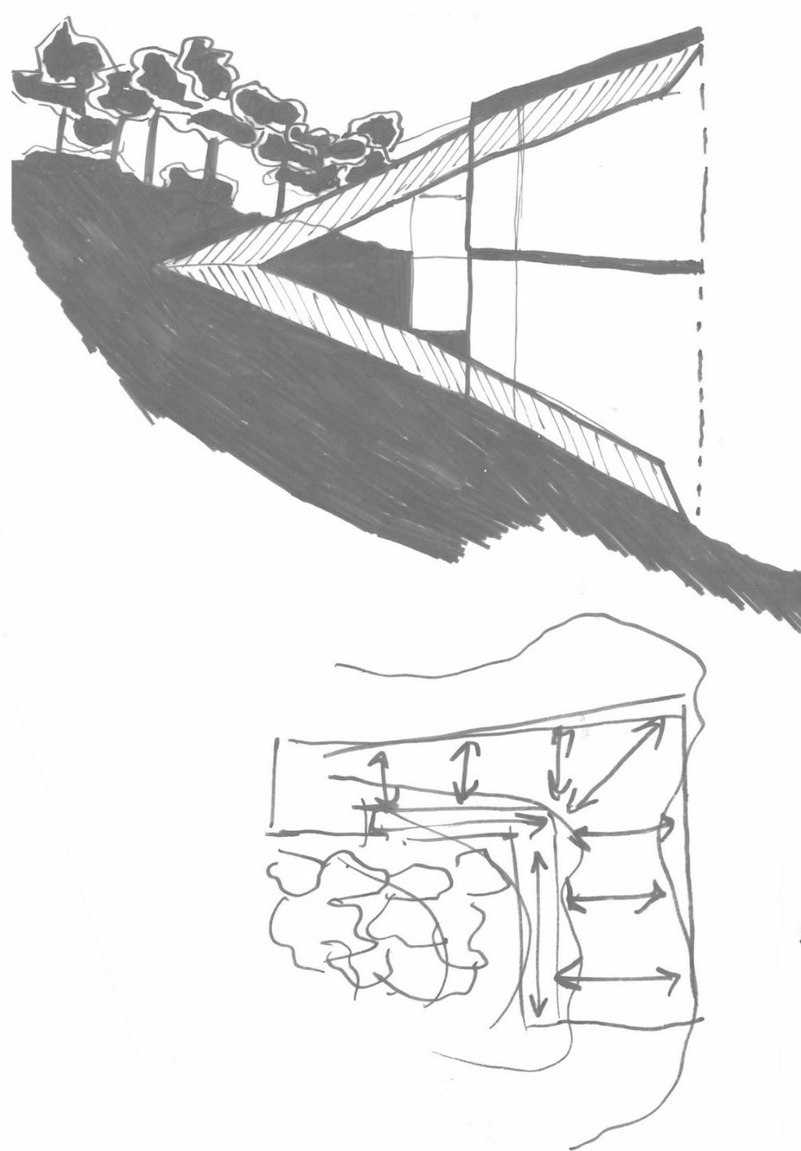
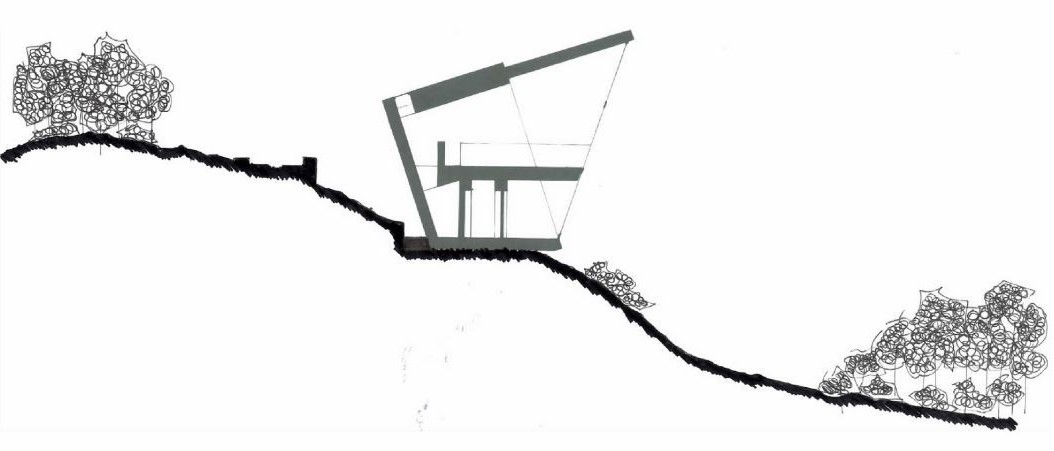
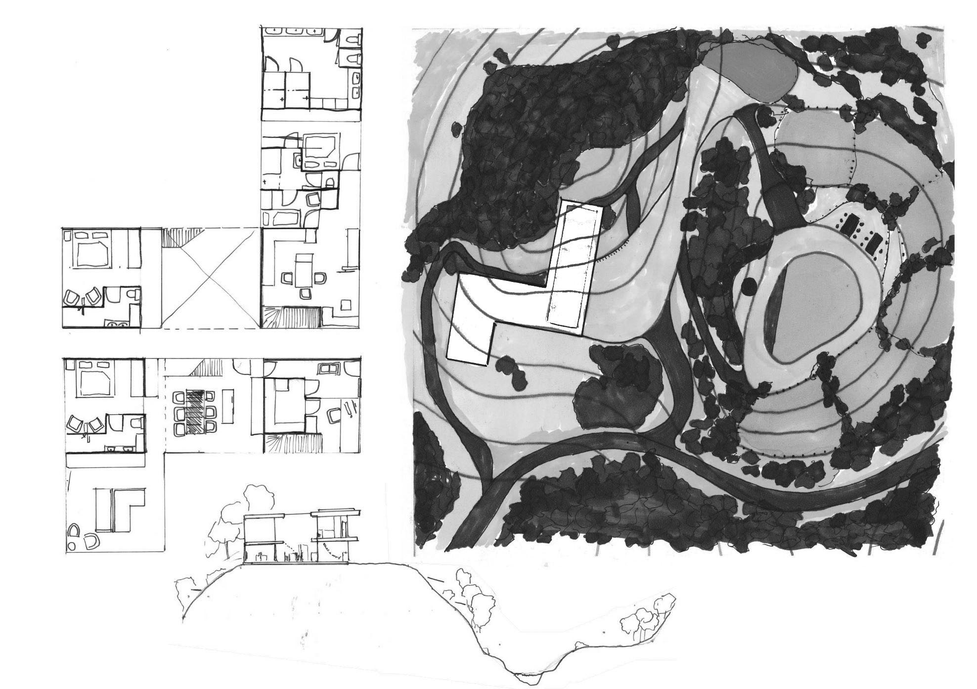
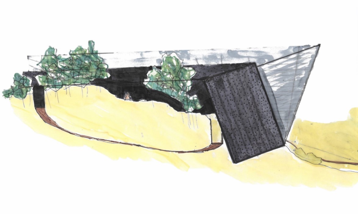
The fist design course was all about creating vision. Not just a vision, but a guiding theme, that would help you make design decisions during the process. In specific the relation between the house and its environment should be represented in your vision and thus your design. The aesthetical quality of the design was therefore subordinate. The goal was to create an integral design of a dwelling in its natural environment. The brief here was to create an Bed & Breakfast combined with a private dwelling. After the students set their guiding theme, they had to do studies on the location and the layout of the possible floor plans. Four main strategies as an guiding theme could be chosen: landmark, hidden, spread out or adjusted to the environment. My design can be seen as a landmark, as it is not only literally (because of its prominent location and height) but also figuratively (in the choice for materials) a landmark. Furthermore, the main design principle that I used was the prospect refuge theory of Jay Appleton. This theory explains that people have a psychological need for shelter (small, dark, warm, save) in their back and a view in their seight (open, light, cold, wind, movement). In my design I tried to convert this principle in every design decision. For example in the choice for location, sections drawing, choice for materials etc. For my presentation I made a scale model as well, as can be seen in the picture.
This assignment was the final assignment of my first year in Architecture. It integrated all the
disciplines of construction, climate design and architecture. The brief was to construct a
"watertaxi (named roboat)"
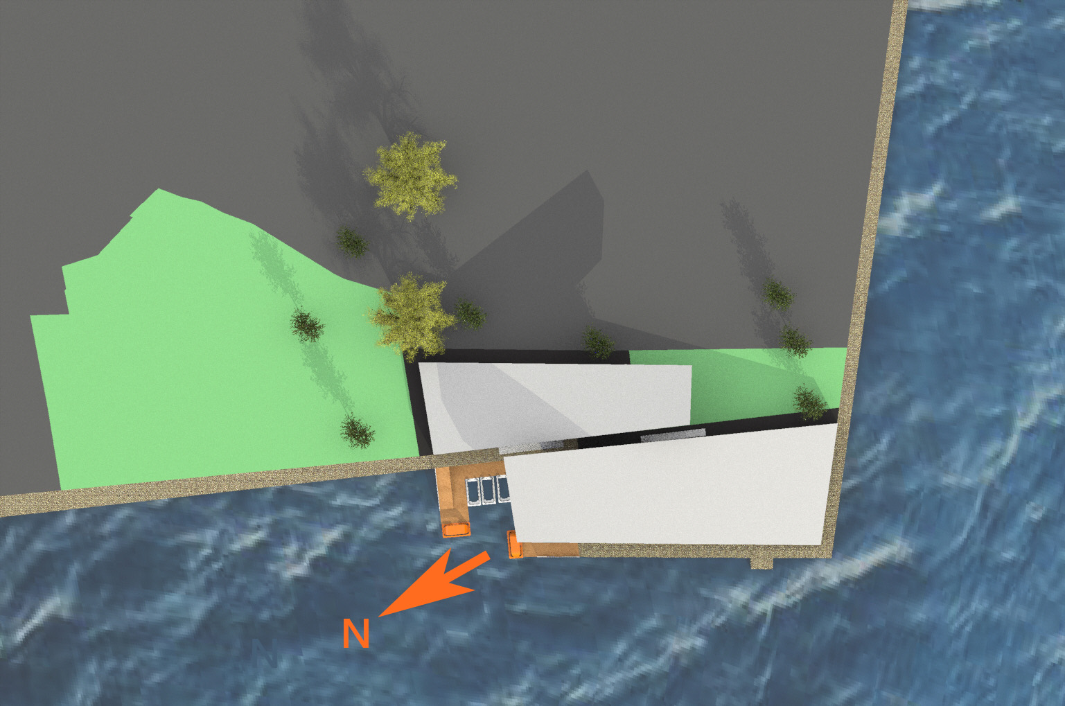
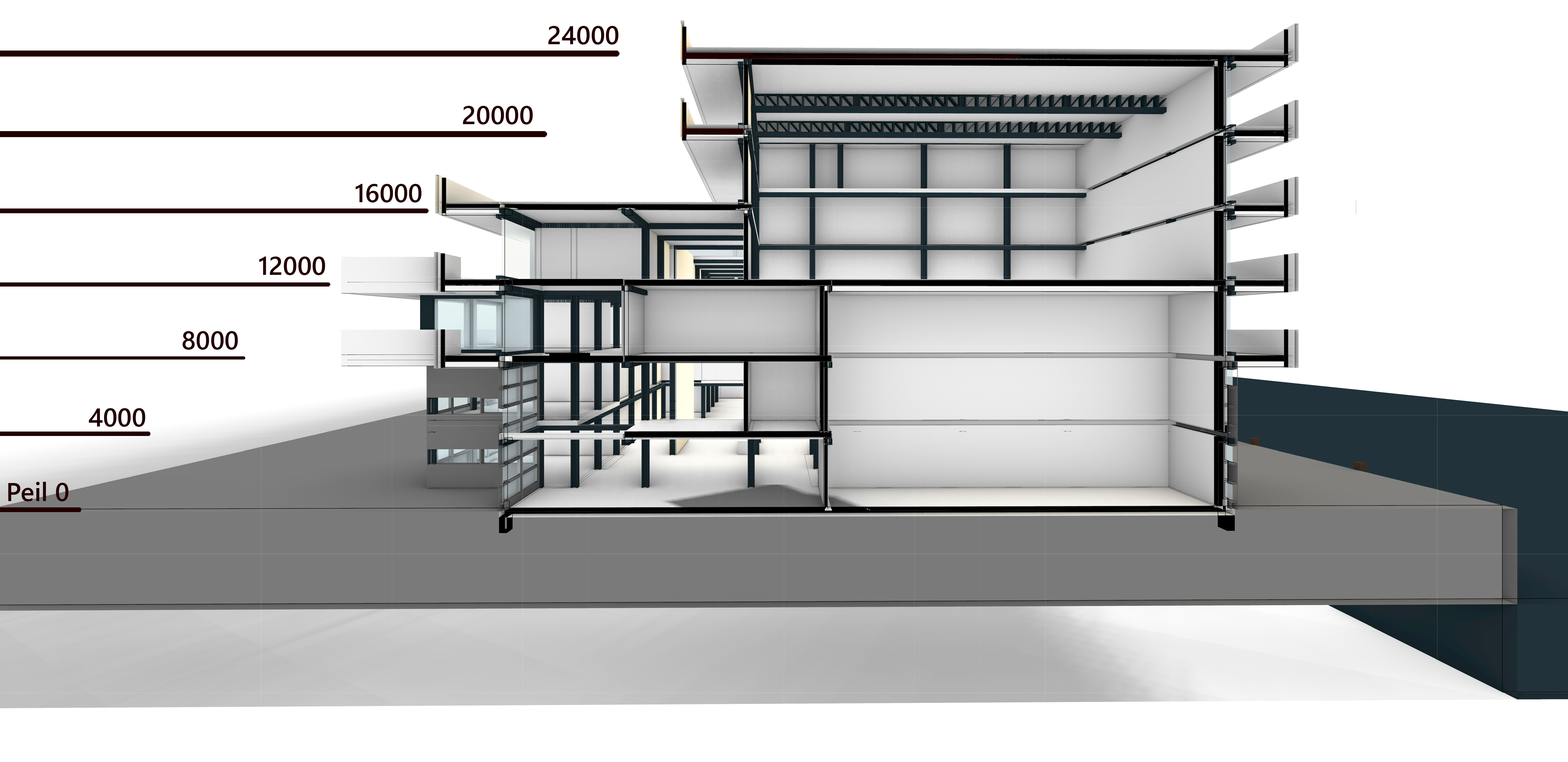
stop, combined with a maintenance and exhibition center on the site of a formal navy basis. This
design
assignment was the first which I really felt I was able to convey my vision into a working integral
design. It was rewarded with an 8.
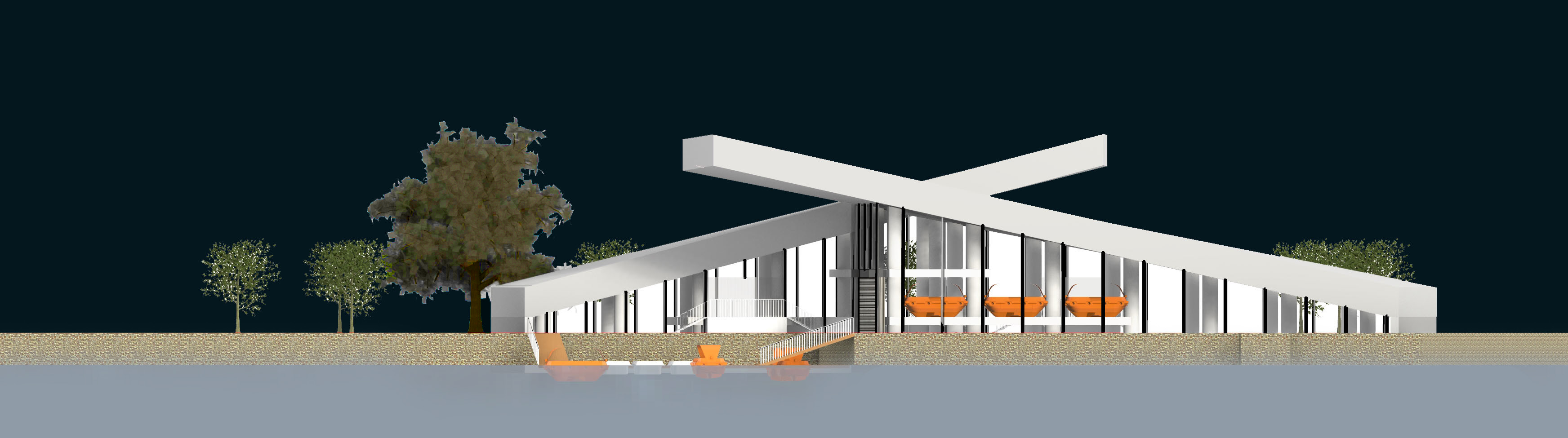
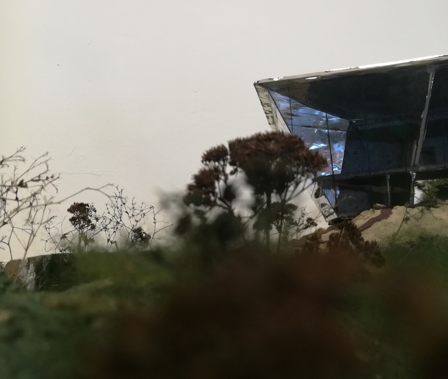
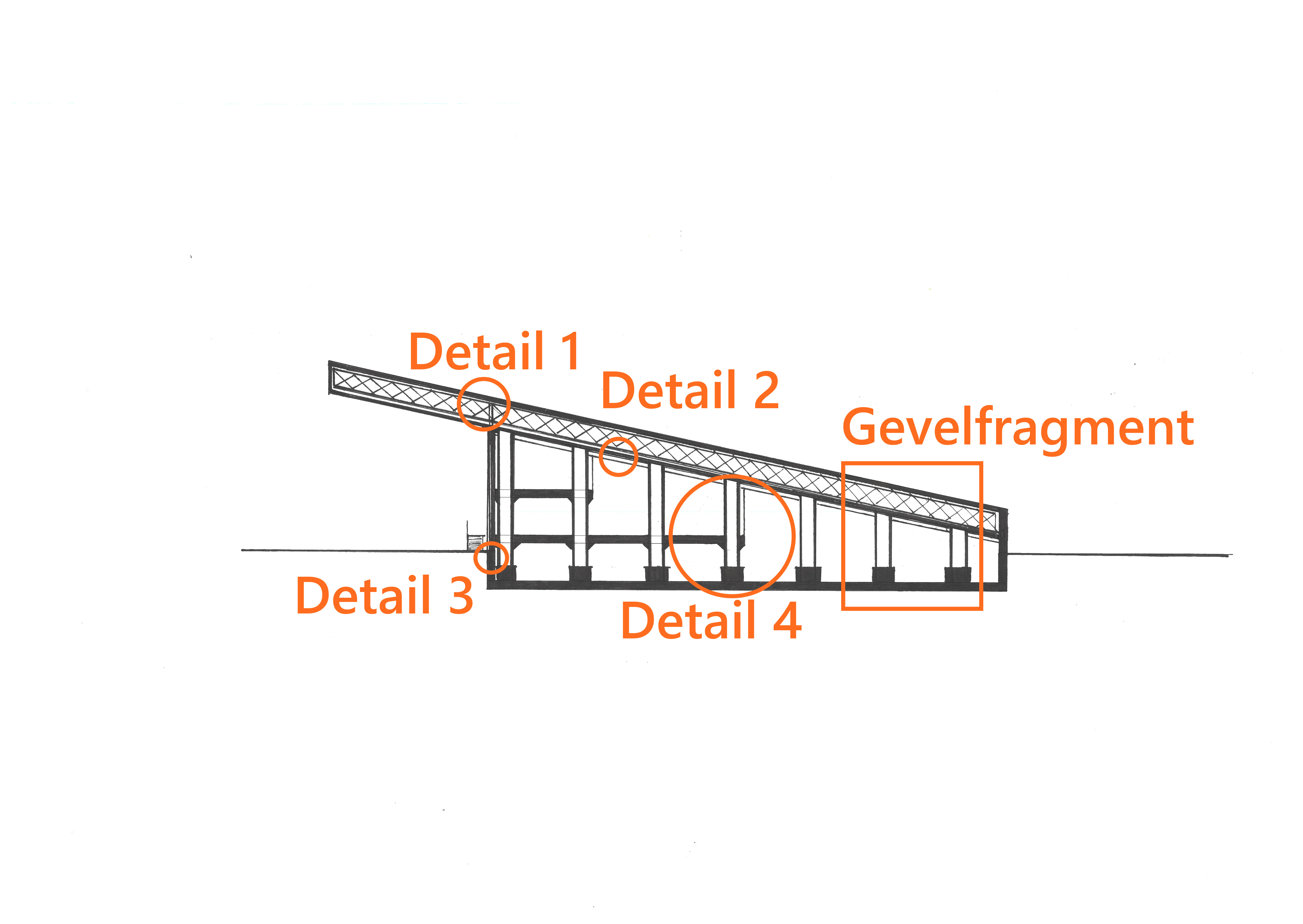
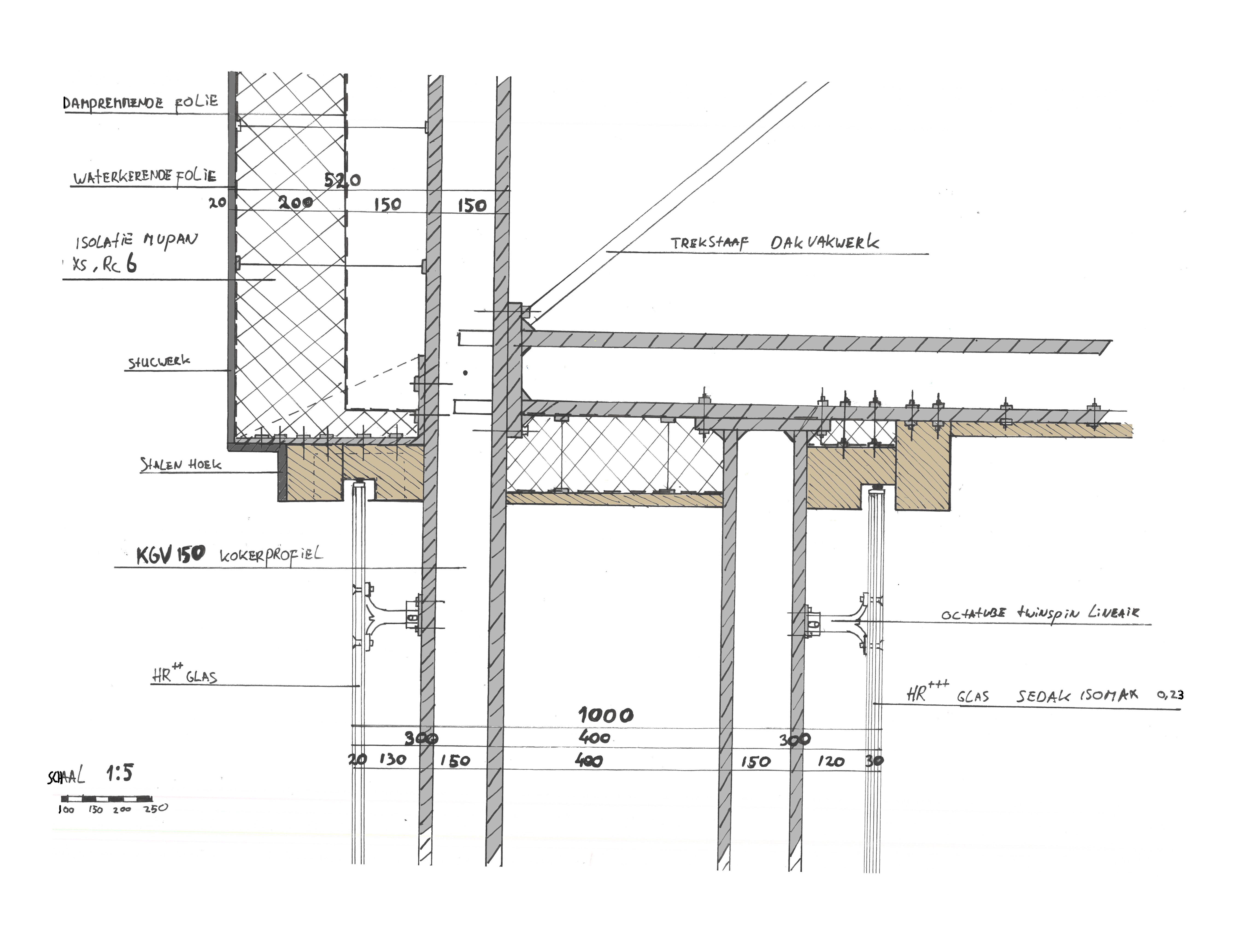
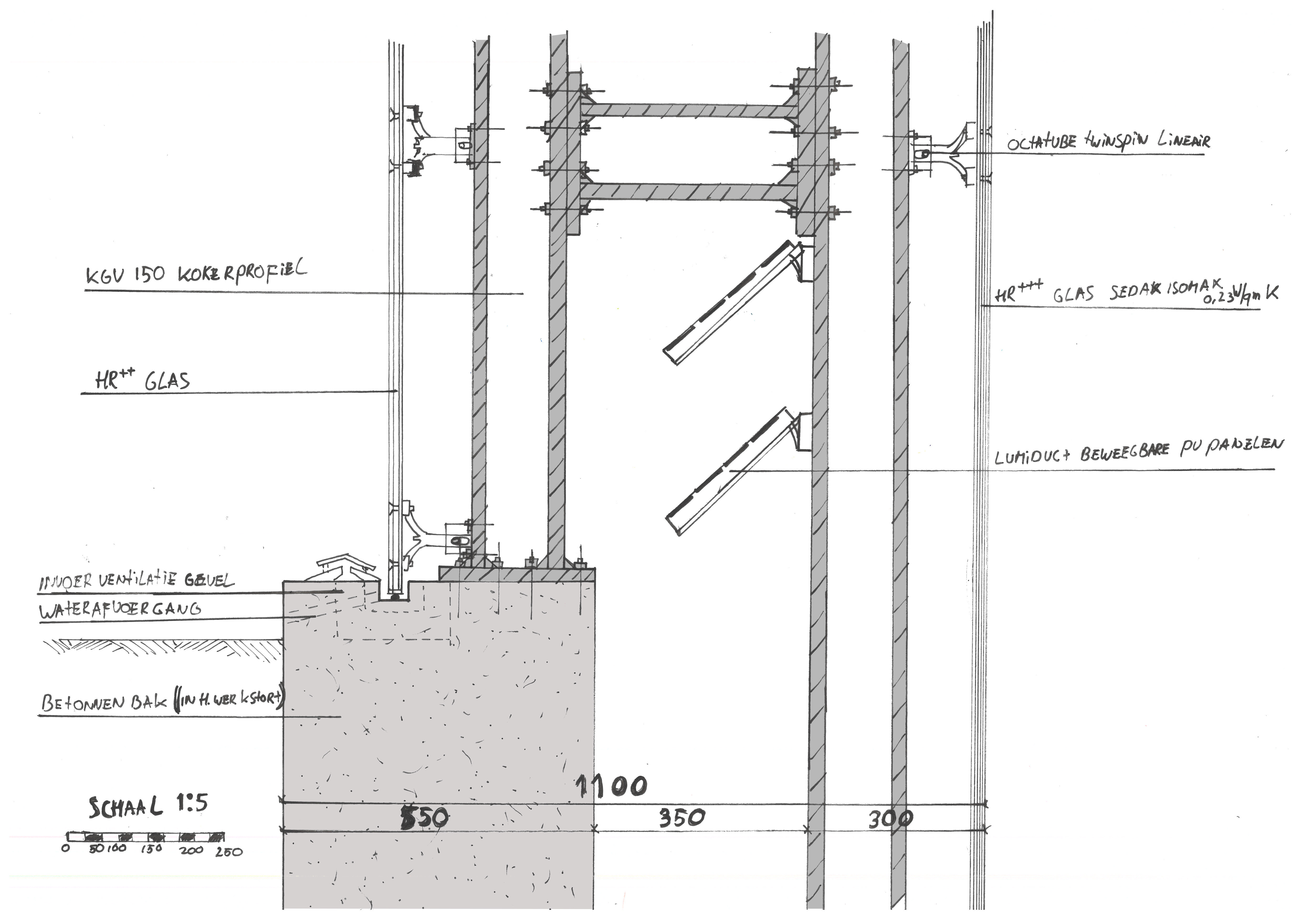
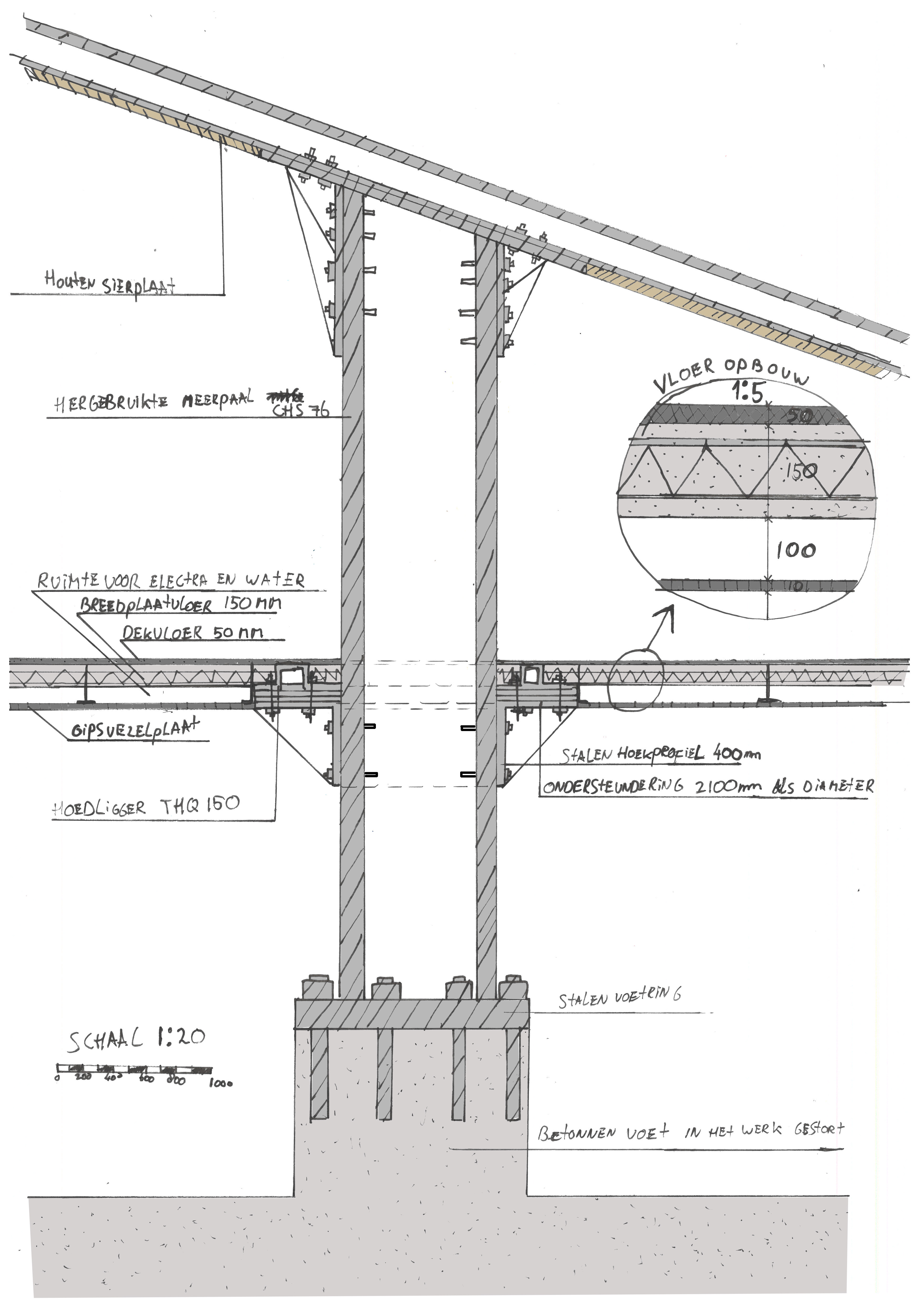
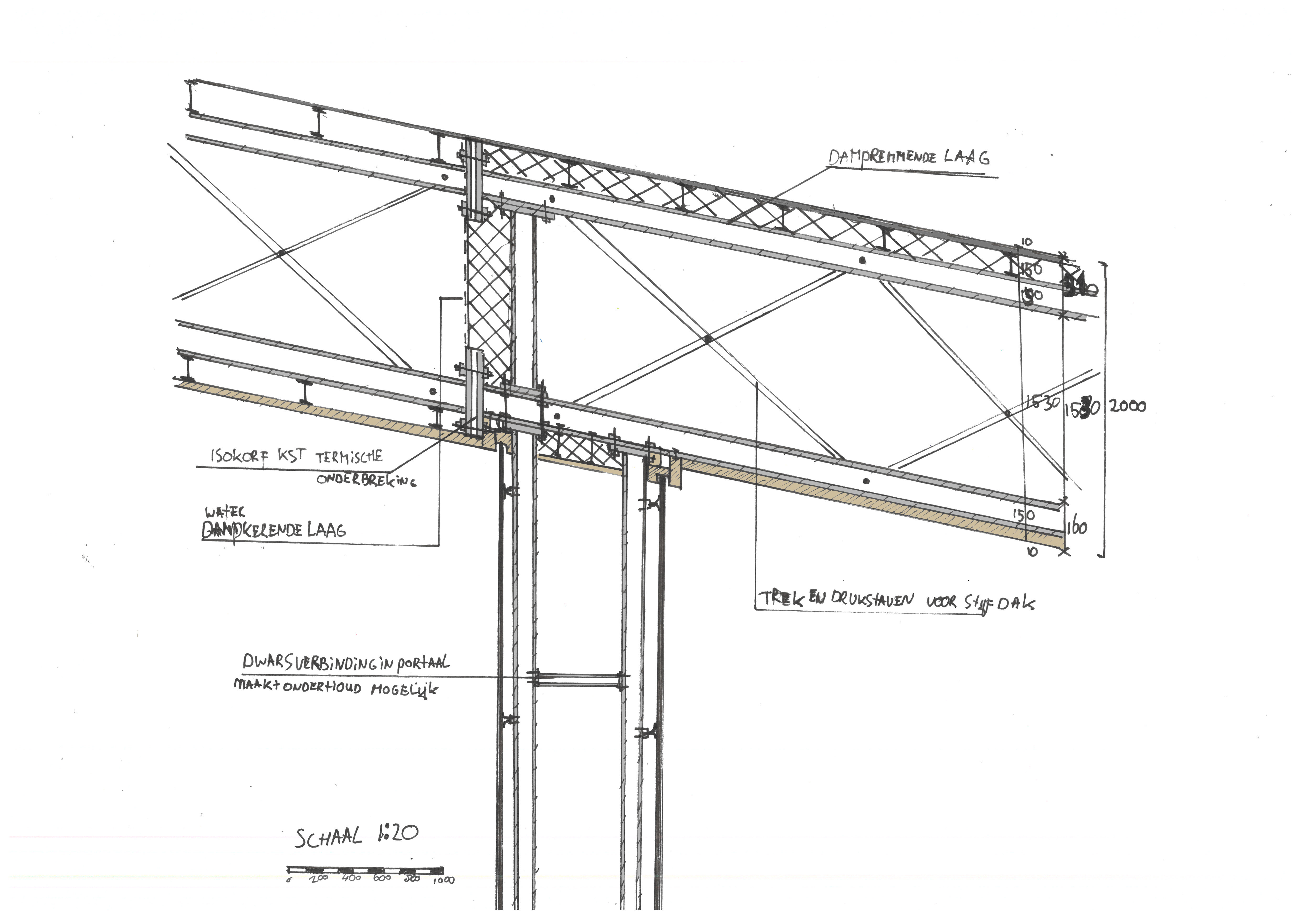
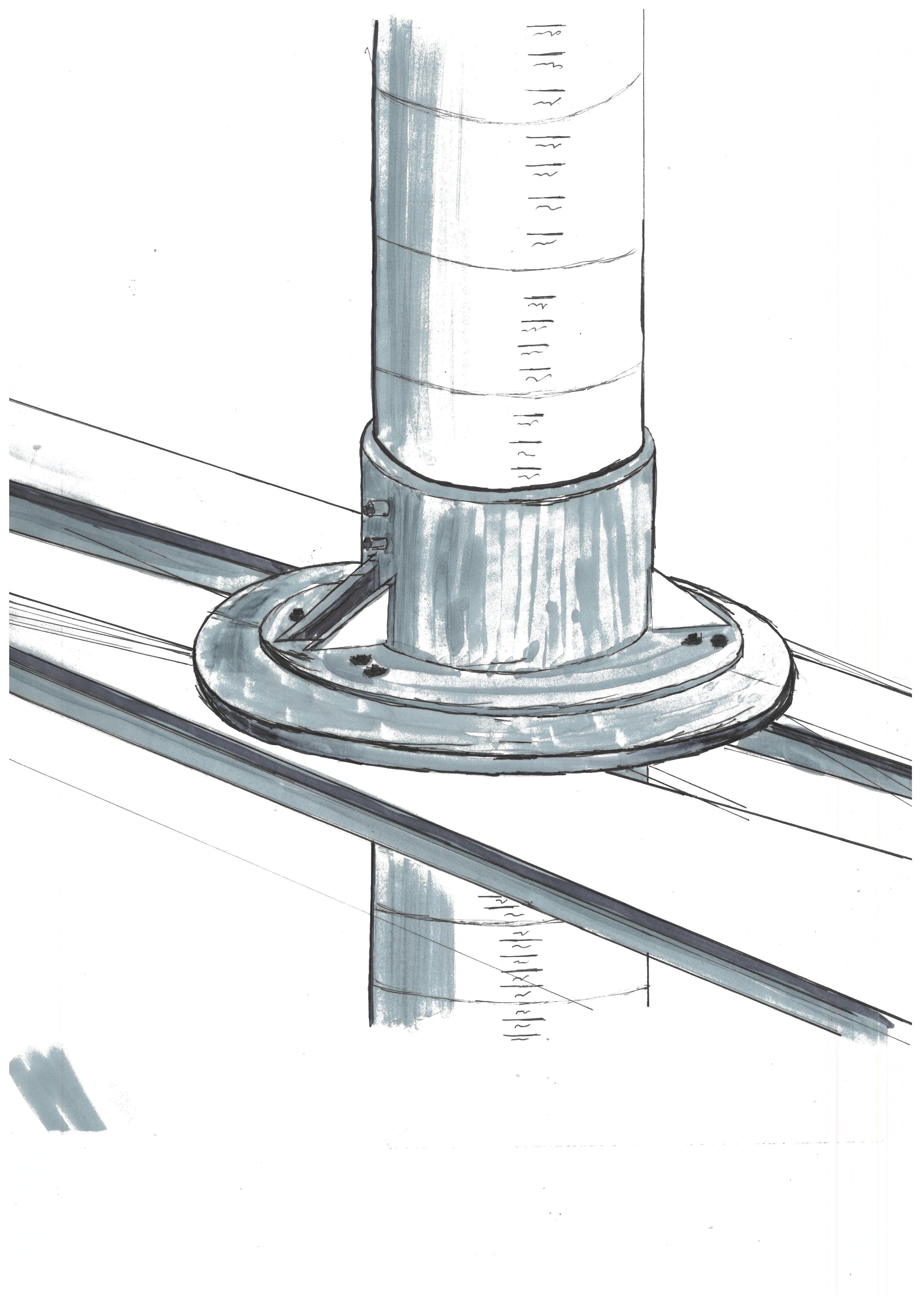
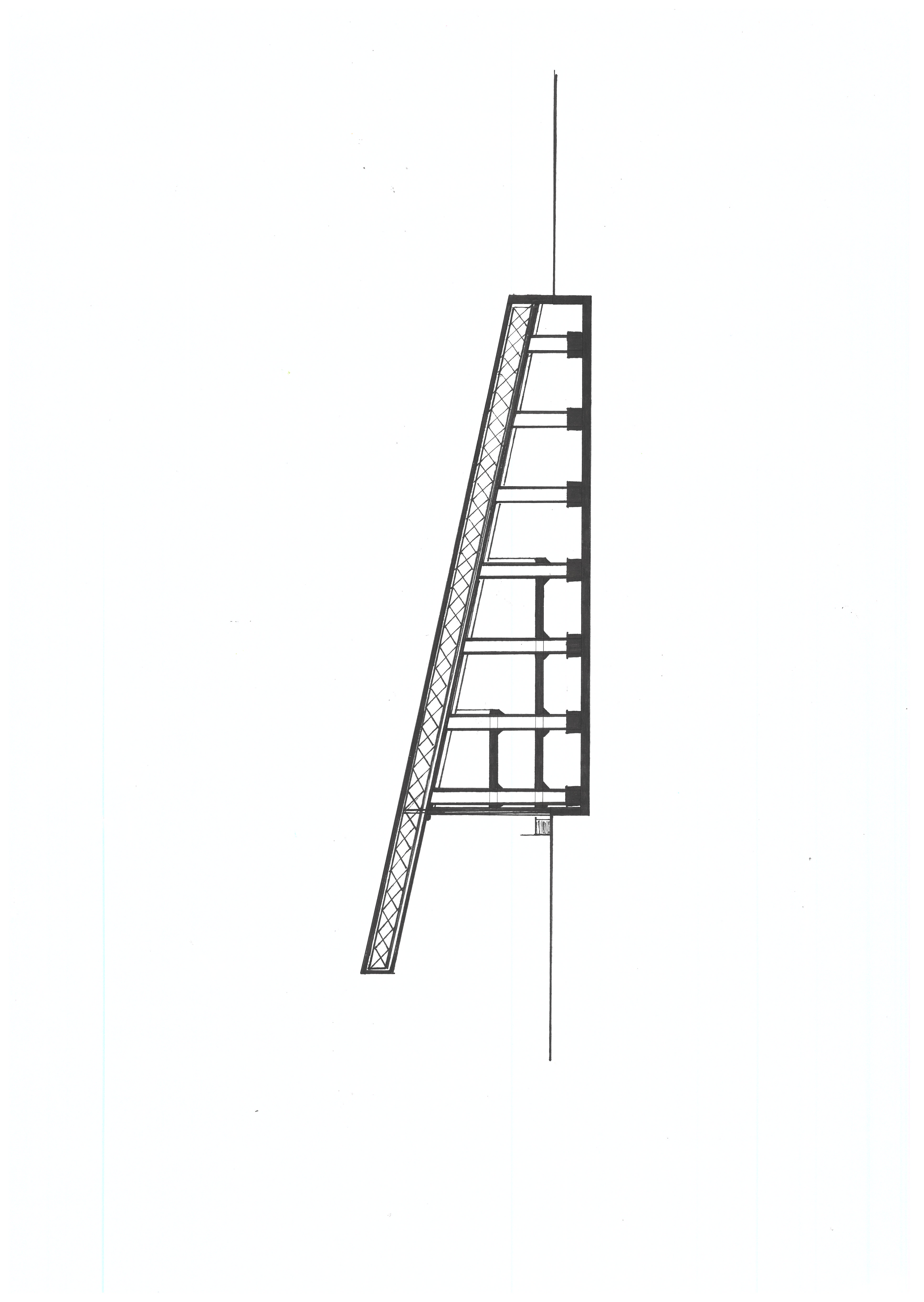
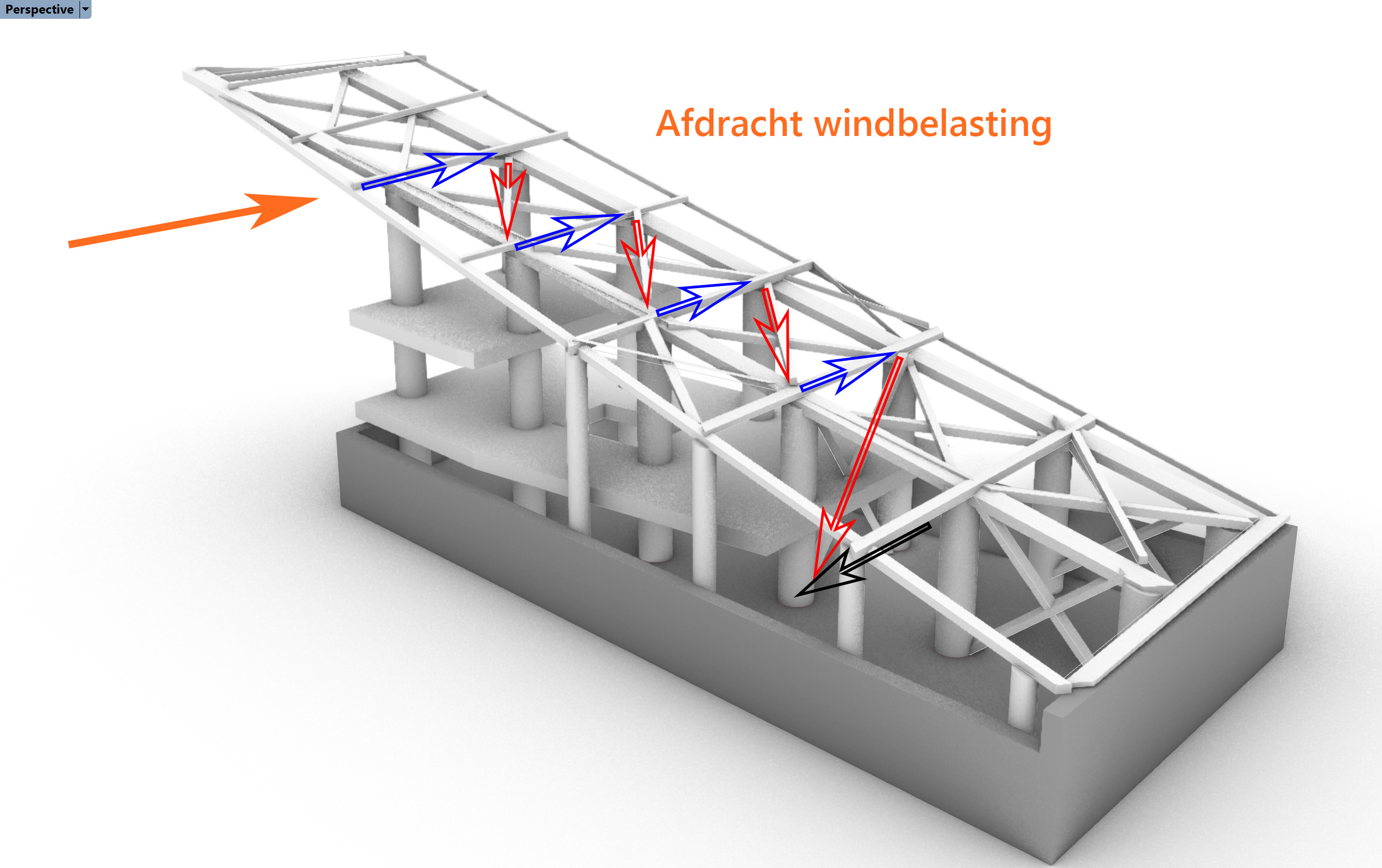
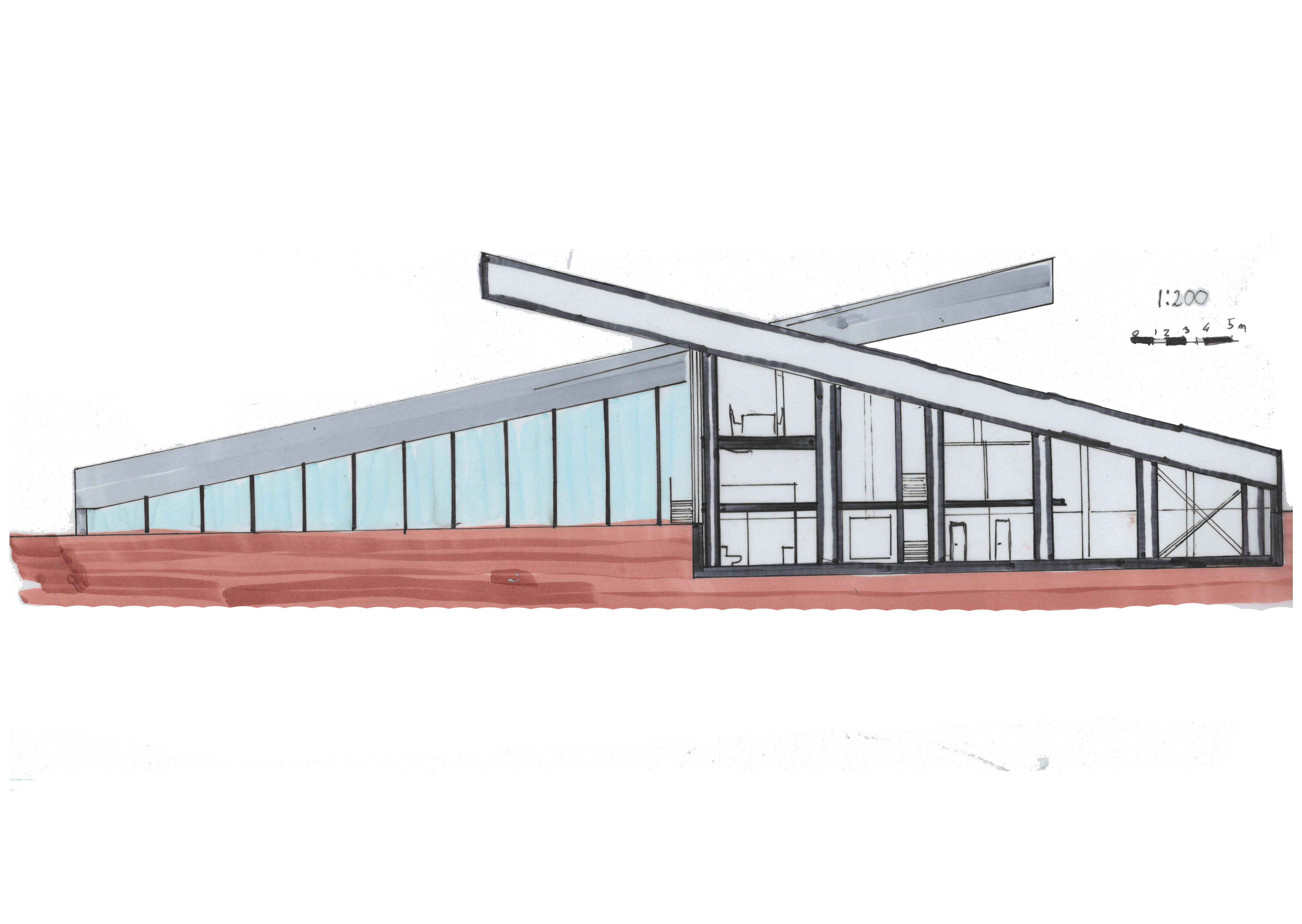
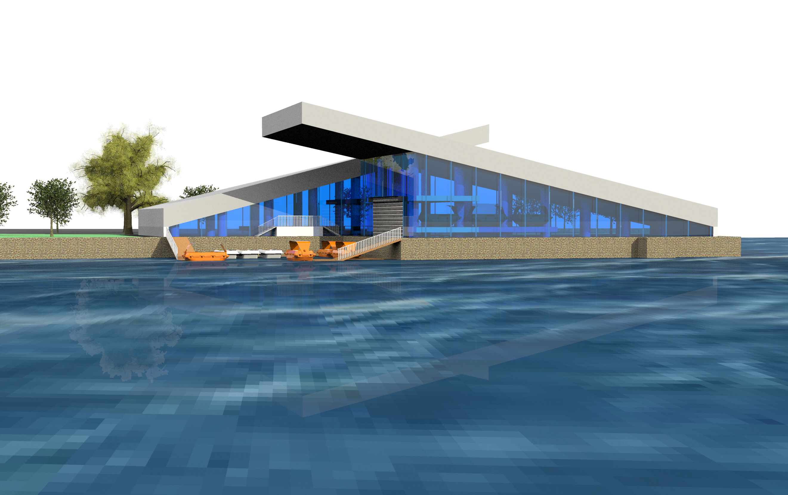
Safe haven: safe area; more generally: place where one feels at home. Especially, as a
military term for home base→
Feeling at home, being safe, on the site of the naval yard, military and imposing because of the
size of
buildings, columns and overhangs. "Safe Haven" is literally what its name purports to be.
Paradoxically
the glass facade seems to support the building from the outside and displays vulnerability. On the
contrary, in the inside a sense of security prevails due to the solid and visible construction.
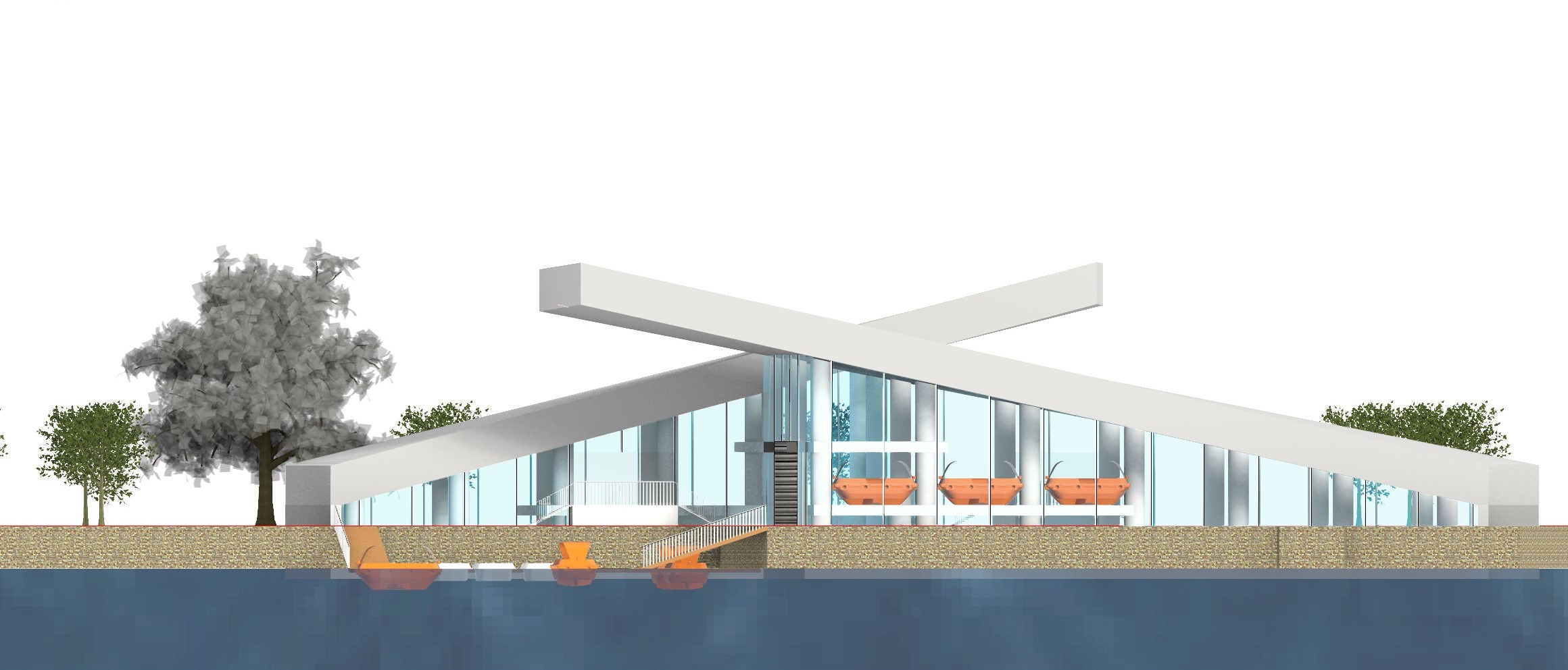
Modern
and elegant from the outside, grand, sturdy and safe on the inside. In addition, safe haven is a
reference to a boathouse. Through the shed door towards the water and the size and structure of
buildings. The height difference in floors quay and jetties provides many views of the water as well
as
the mooring. The waiting room, boat shed and control room are all located on the waterfront, and
together with the other spaces they form an efficient organization that puts ease of use first.
Thanks
to the special second-skin façade with solar panels and the buffer function of auxiliary spaces, the
building, in combination with the heat pump, is energy neutral despite its glass façade.
Sustainability
is also reflected in the steel supporting structure, which consists mainly of reused mooring posts.
The
design merges busy city and shipping traffic with the tranquillity of the park. This was done by
using
as many of the site's existing axes as possible, enhancing the spatiality rather than disrupting it.
The
slopes of the buildings also provide special vistas, but above all, they form a unique dynamic
perspective.
.jpg)
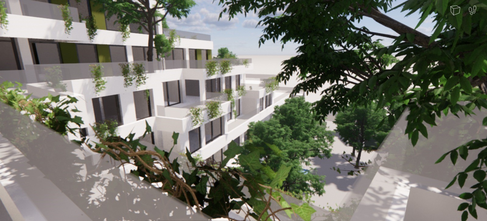
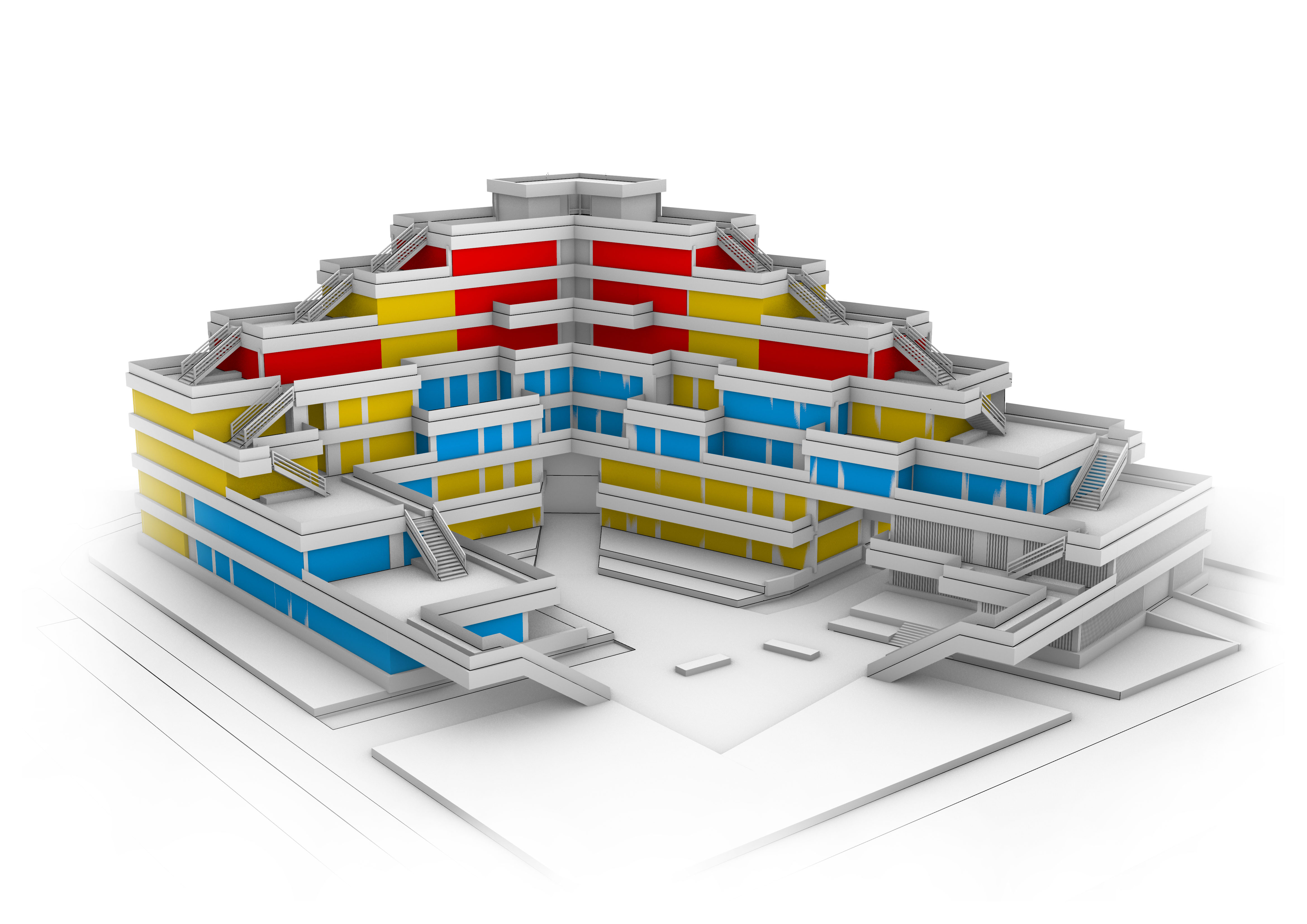
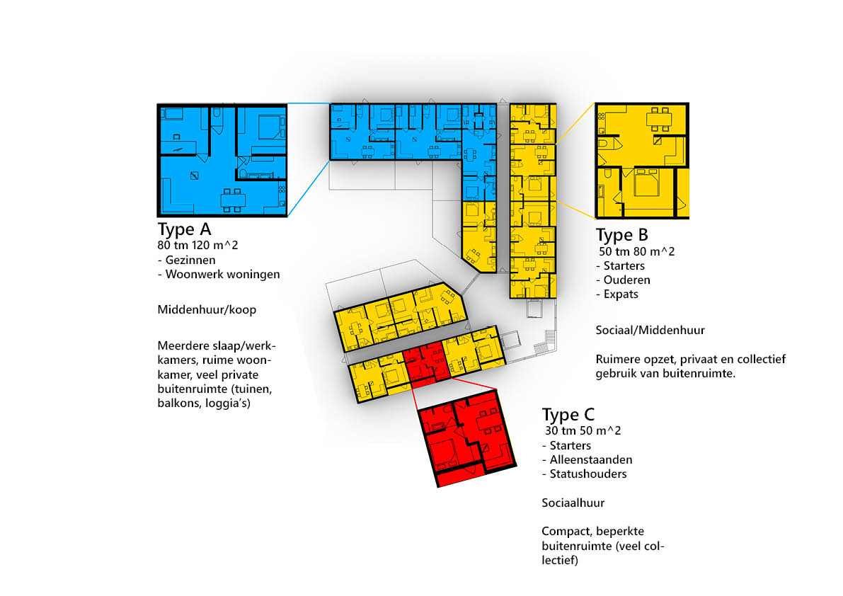
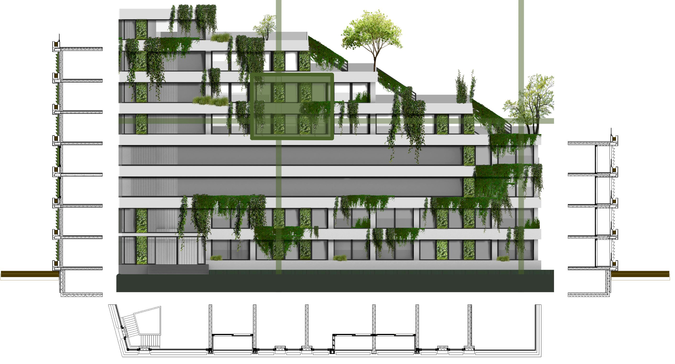
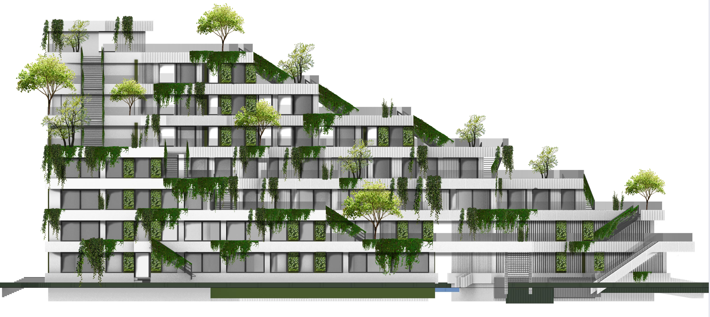
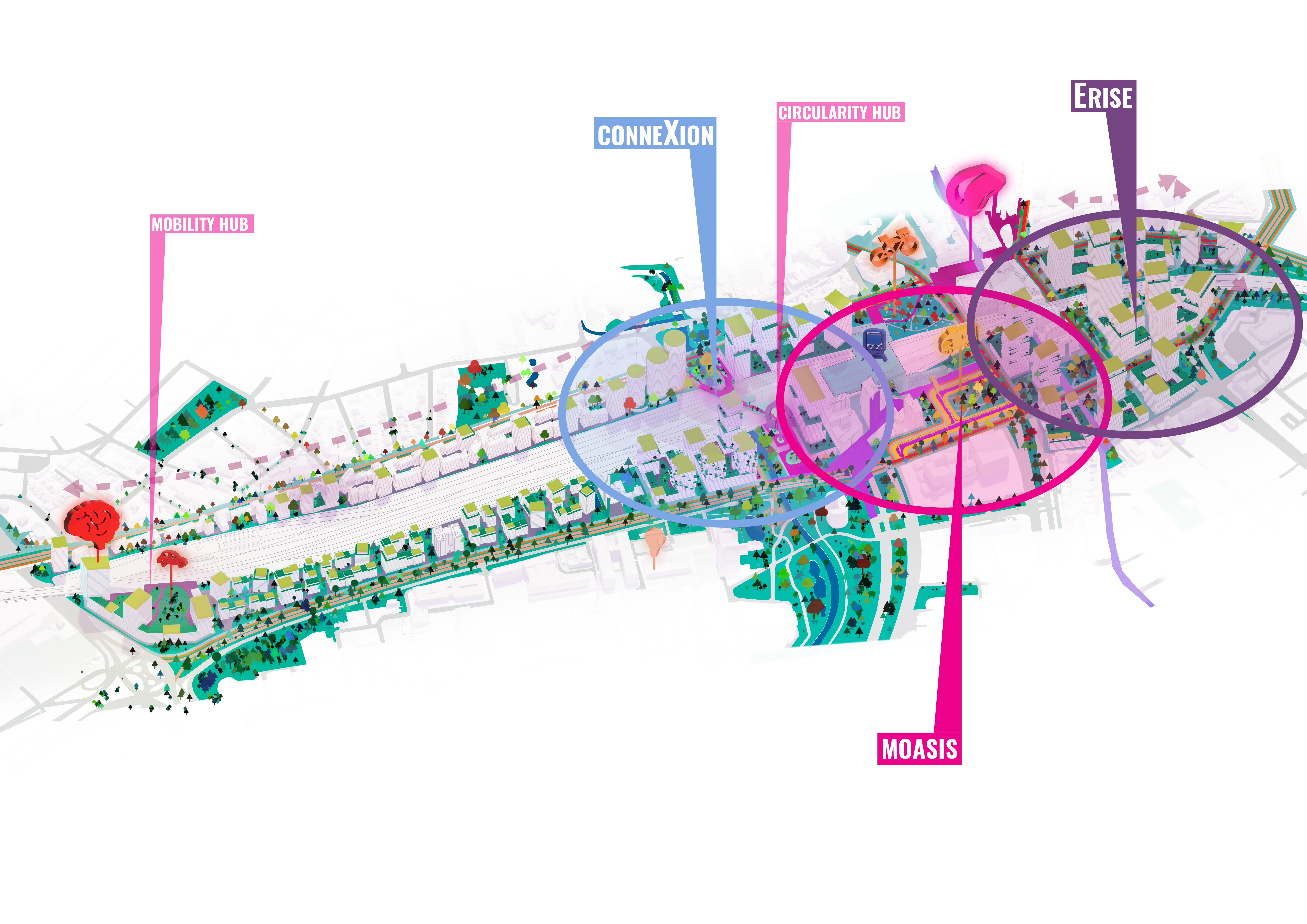
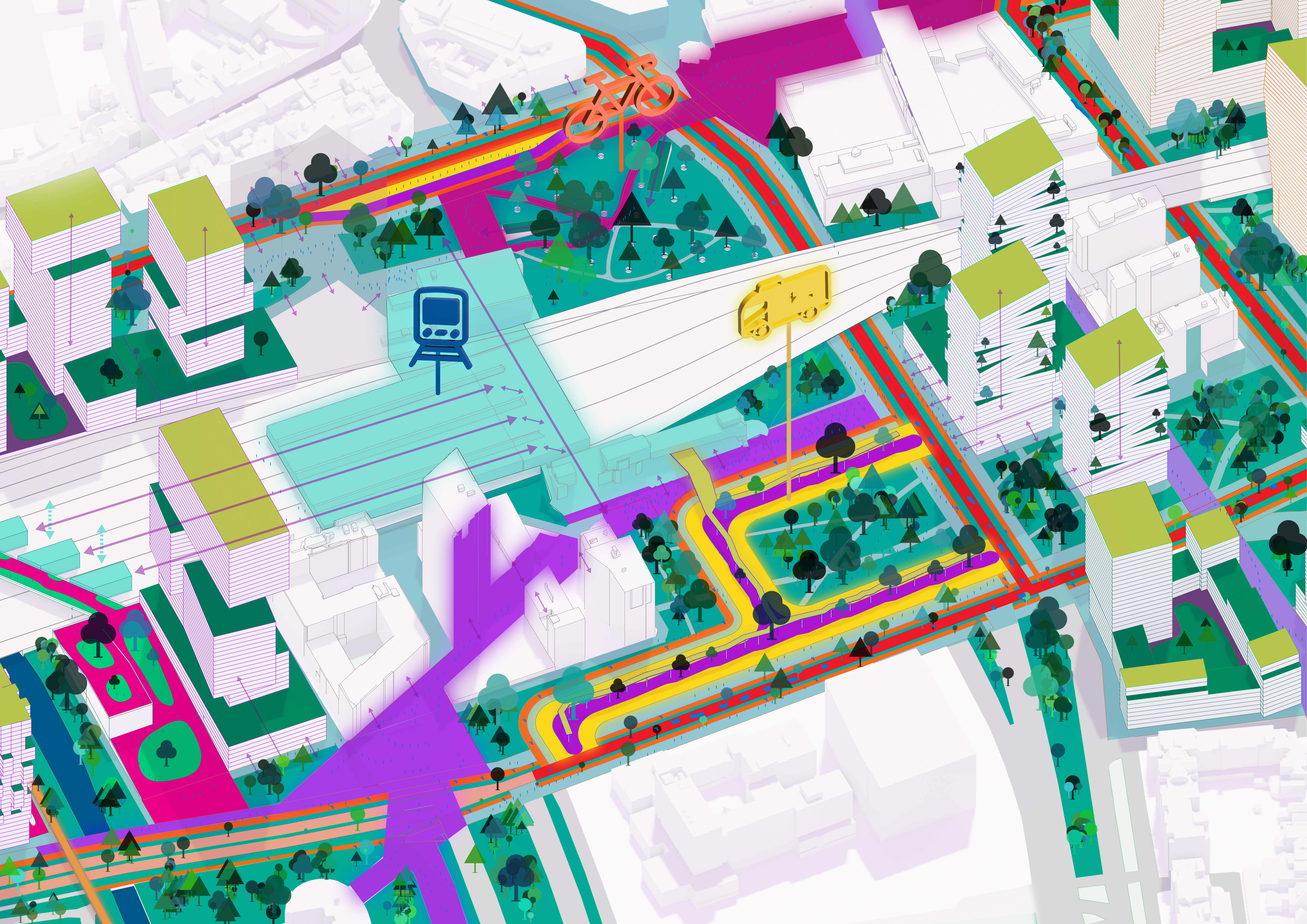
In the second year, students were thought more about construction, and climate, however, this year also emphasized the urban scale of buildings. Apart from urbanism, this included designing apartments, and in special to embed renovtion in our designs. Therefore, in the final design assignment of this year, we were asked to renovate an appartment block, by densifying it and, making it more energy neutral. The design that I came up with intended to break with the "wall" structure, of the former site, were the appartments and greenery were stricly sepperated, which invited people not to come out of their homes. My design focussed on bringing back the uniqueness of people and their dwellings. It differentiated the by adding a stepwise orientation of appartments, and altering the floor plans to include a mix of target groups. So no dwelling would be the same anymore. Furthermore by including greenery the environment was more attracting and also contributing to the sustainability of the building. Since in the summer most sun would be blocked, while in winter with no leaves the limited amount of sunlight will reach the building. To realize this an irrigration system (which provided plants and trees with water) was designed in the facade. The mythical city of babylon was my inspiration for this. brought back in this. This project was also rewarded with an 8.
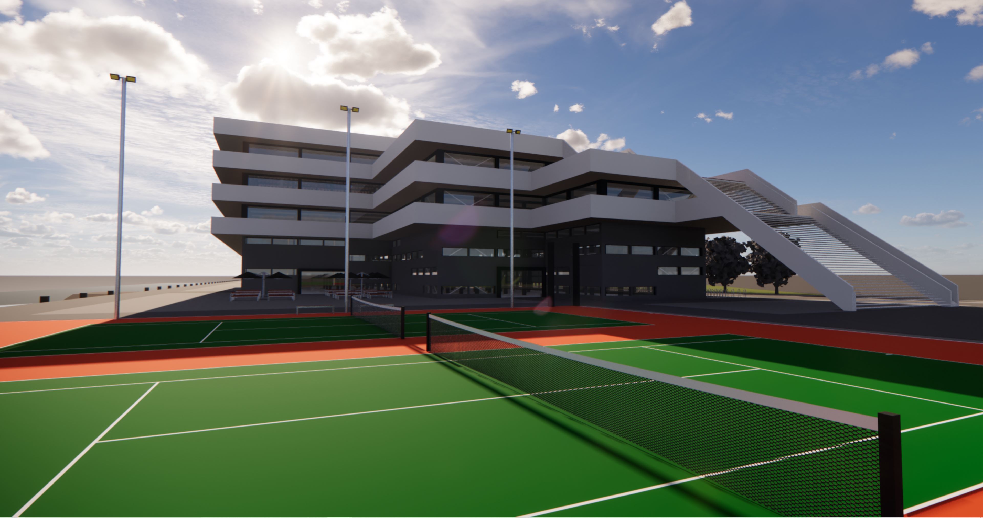
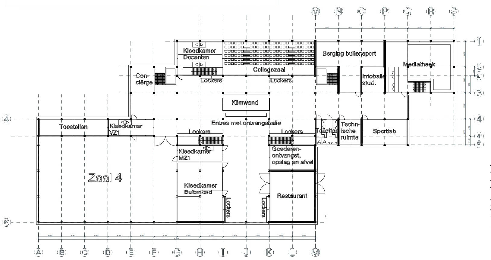
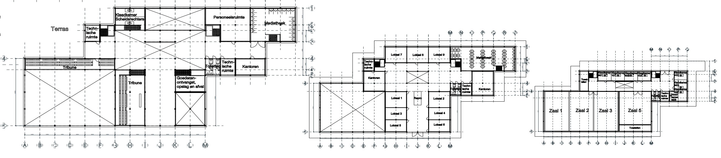
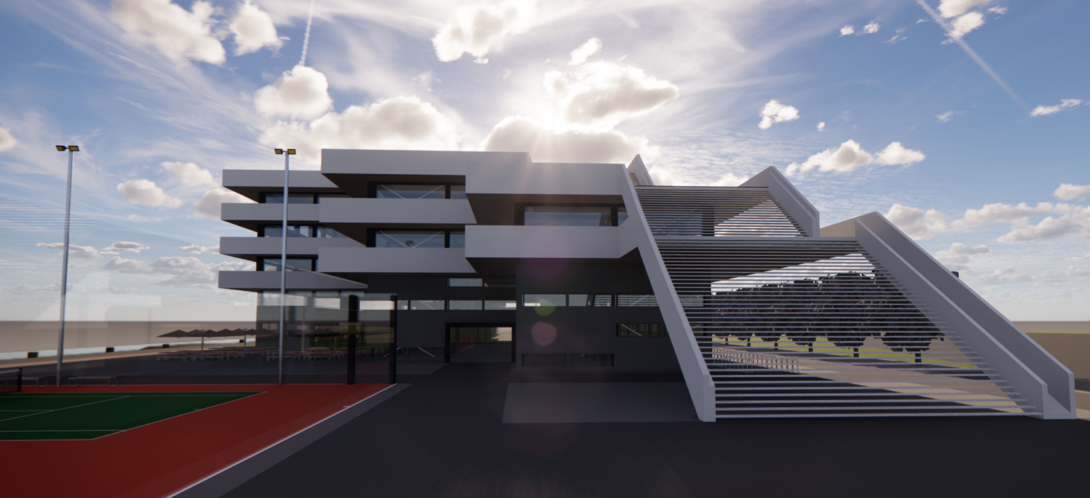
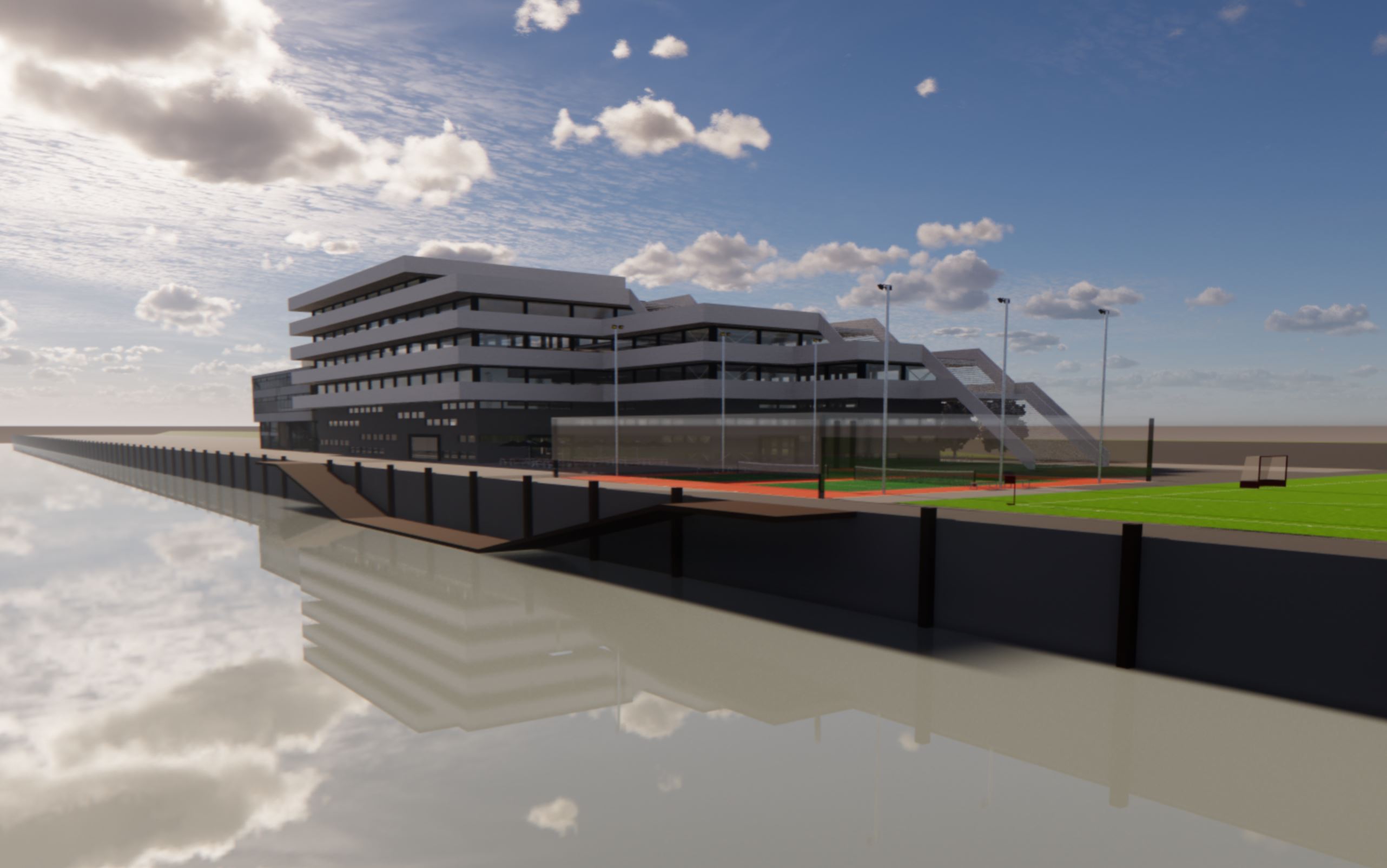
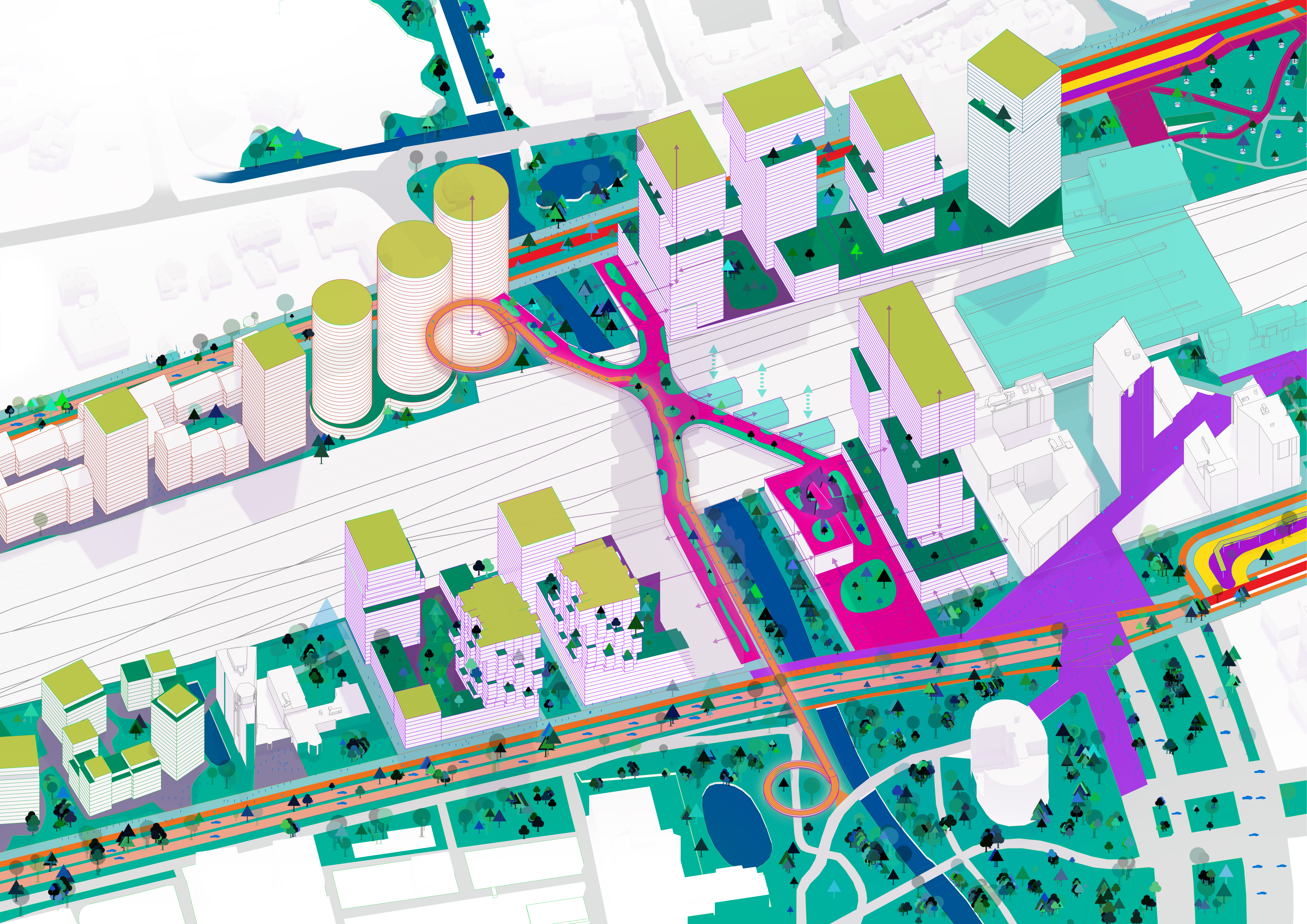
This was my final bachelors project. In this assignment all the knowledge we aquired in the past three years was needed. Since the brief consisted of a utility construction of almost 6000m2, with mixed educational and sport function, designing this building was the biggest challenge I faced thus far. The design included sports halls with interior climate challenges as well as differering heights. My inspiration for this design derived from the harbour architecture and its functionality. I saw that different functions in the harbor were clustered in lines from quay to railroad. I tried to involve this concept in my design as well. Furthermore, I wanted to have a representation of these lines in the facade as well. I did this by combining all around white balconies (with solar panels in them) with a facade with computarized movable elements that could block sun if needed. One of the major inspirations for this design came from the Veles et Vents building in Valencia.
In all honesty, in the beginning I did not quite understand my role. I didn't quite understand how a real estate developer could interfere in the construction process without "adding" anything themselves. An architect/urban planner designs. The municipality (buys) land and arranges permits. The contractor builds. The user pays and maybe there is an investor in between. But what added value does a property developer have? After a while, it became clear to me. So the developer gets in between the process to steer it, improve it and make it feasible. Moreover, the property developer, in his proactive role, often gets parties to find each other to get started in the first place. To a certain extent, the real estate developer creates his own work. I like that principle. I had filled in the selection options beforehand so that I would have a steering role in the process. I had expected the role of project manager to fit that best. I was assigned a different role. Does that mean that in retrospect I am less happy with my role. On the contrary; The Real Estate Developer brings parties together, has a lot of influence on the process, partly because of this, and is also just content in the plan. The property developer takes a lot of his own initiative, and yet it is very important that he makes an attractive proposal for development for all parties involved. So he is not only essential to the process but also has a lot of influence on it. With his expertise and network, he is constantly working on how to make cases feasible. In doing so, he puzzles with different locations, boundaries, public transport connections, green links, etc. I really enjoy the tactical aspect of this role. In hindsight, I found this to be a great role, in which I could be completely myself and express myself perfectly. I like to work proactively and with people. I like to create opportunities and have a lot of influence. The dynamic form of cooperation in different, changing subgroups that this role requires is right up my street. As far as I am concerned, this is the most enjoyable role.
In the pressure cooker of ON5, at the very beginning I tried to be short and to the point, coming across with strong content but otherwise not standing out. By steering very lightly early in the process, you can influence people. The best influence is when people are not aware of it. So nudging (as explained earlier in Negotiation Strategy). In fact, I think I was quite dominant in the group in a later phase of the location choice. Especially in the location selection, I lobbied a lot and tried to convince. I tried to give clear advice without, causing irritation. Of course, my fellow group members have the freedom to choose for themselves and I especially want to let them feel it. After the choice of location, I took a step back; I felt I would otherwise become too dominant and had to leave room for people to gain expertise about our new subarea. In the process, I shared my outline of the development strategy so that when my colleagues worked out their plans, my locations were already in the back of their minds. During those weeks, I mainly worked with EZ to look at the different business cases. I also had frequent contact with other roles to discuss whether and in what form the envisaged development would be feasible. From that, the question immediately arose of where exactly, how full, how high, how and for whom we will build. From my development strategy, I naturally already had a rough idea about this. From the start, I therefore kept a file with the developments and started drawing and calculating them. After personal consultation with basically all group members, I adjusted and optimised this list of developments. Some locations added, some removed, bigger smaller, other functions, other segments et cetera. In the end, I presented this. This is also when I clearly got involved in the group again. Now that the envisaged developments have more or less taken shape, and the group members are further explaining their own plans, I started to actively comment on their parts. Indeed, the integrality of the plan is essential to its success, which is entirely in my interest. I hammered a lot on consistency and essence of the plan. I also suggested coming up with names for the axes and developments to create a real connection and make a Rotterdam plan. Overall, I also think I have done the role well. The tricky thing I did find was that I went almost entirely on my own initiative, which made me slightly unsure about whether I did well, or very specifically, for example, what to put in my role report. But that doubt may also be part of the role to some extent. Overall, I managed to steer the process in such a way that, in an intensive and substantive collaboration, my proposals for property development almost all went through in a strong integral collaboration with other parts of the plan.
The substantive cooperation has been very strong in our group. We have, in my opinion, zoomed together often, and for a long time. We talked a lot and for a long time about how we wanted to approach it, while also discussing a lot together as a large group on a smaller scale. In retrospect, you could say that some of this time could have been put to better use by agreeing on/producing more in subgroups. We waited a long time as a group to make things final. But in my opinion, the long group sessions certainly contributed to our plan becoming very strong in terms of its integrity and content. As a result, we discussed and considered everything extensively. I dare say even more than most other groups. During the meetings, our group teacher regularly told us to talk less and produce more. Because we finally managed to make this move, our plan only got stronger. It did require a lot from all of us and especially considering the online variant and possible motivation problems due to corona, I think we did extremely well. I sat in separate zooming sessions with everyone and also everyone represented their interests. I learnt a lot (also on a personal level), made friends and had a very good time. I am proud of us as a group and the result we achieved.
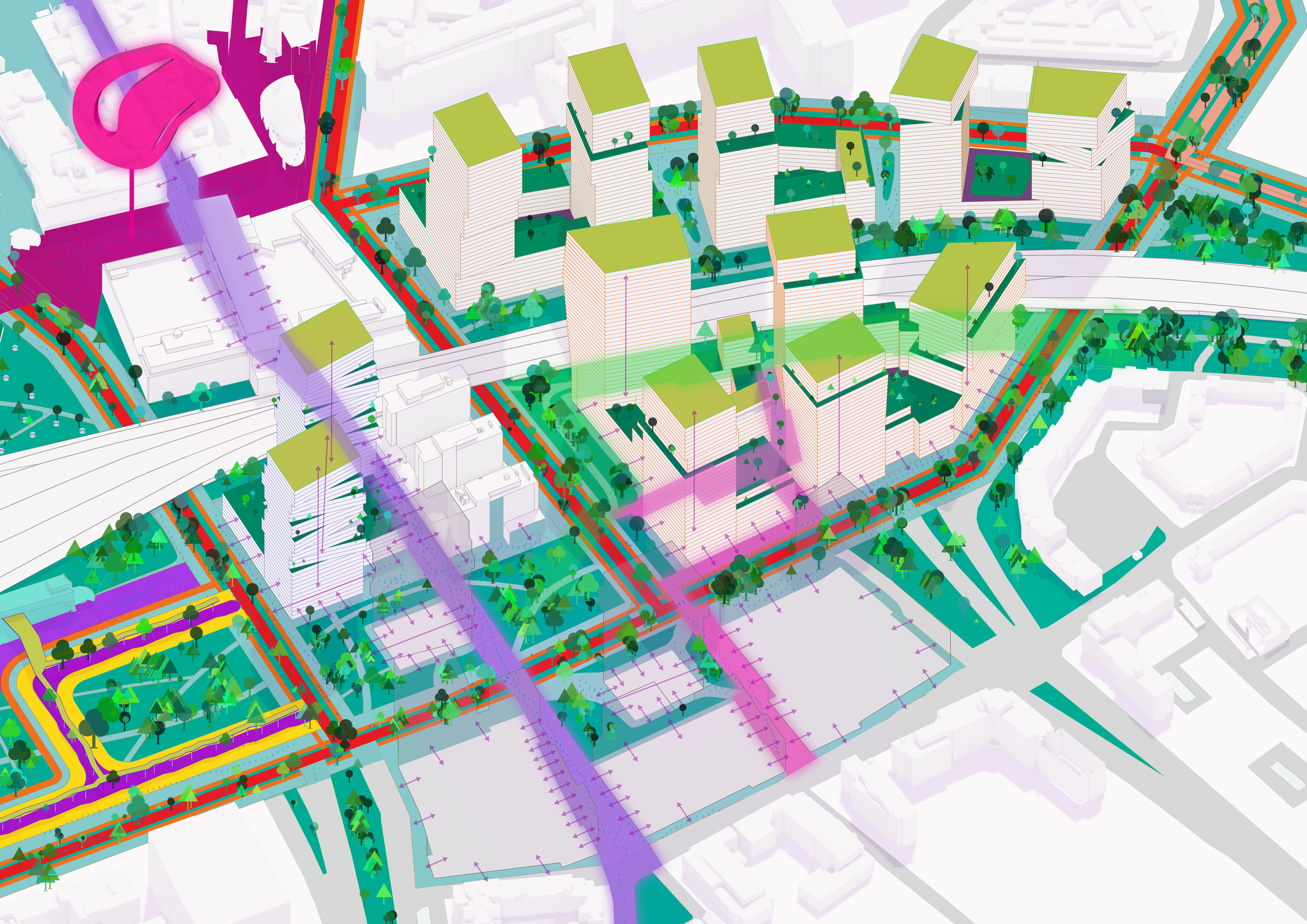
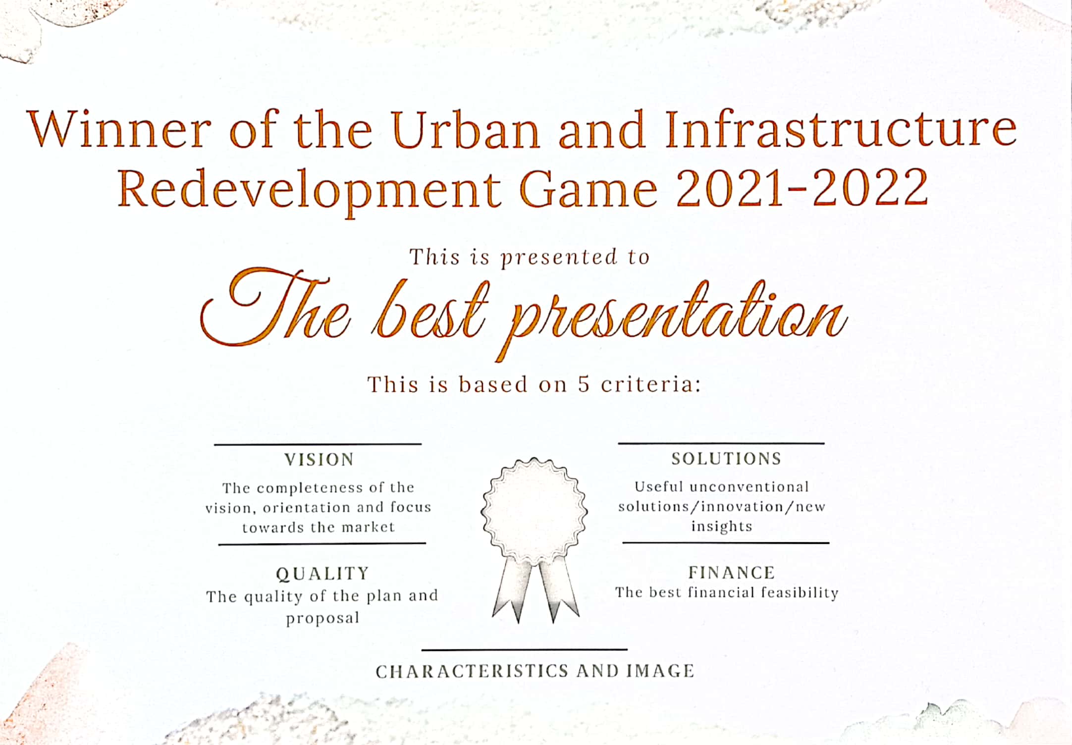
Like the first management game this was all about managing an area development (Eindhoven). Here I also played the role of real estate developer. In this course we decided to go for an very futuristic look, which was very much appreciated given the fact that our group was rewarded the first price, in the competition of plans in our year.
As “playing” the real estate developer was the second time for me (while I also did this in the ON5 course) I knew what to expect. The challenge for me was mostly about the new area and the new group I was working with. Furthermore, the role of developer B was slightly different as it focussed on commercial developments in special. In that way the financial feasibility was more essential to the developments compared to the ON5 course. Also in this management game, we as developers had to define our own company in terms of size, turn-over, character etc. First I thought to be a very social developer that was all about collaborating with others and not making a pro fit. However, this is not a commercial developer. So then I came up with Constection, which is a commercial developer but which only focusses on design and construction. By selling developments in advance (as is often done with the construction of houses), financial impact of investors and risks over time are limited. Because of the ownership of several plots I had to make decisions about what to develop and what buildings to maintain, because of the income they already give to the company. I therefore found out that my role actually had to comply with two different playing fields, to the group for the area development plan and within my own business. This challenge to take the company’s objectives into account while also negotiating with other stakeholders was new for me. I found this quite challenging. Nevertheless, it makes the management game even more realistic. It made me familiar with the internal tensions that a developer has. He consistently has to value and assess all the options to both fields of interests. What I did acknowledge and like with the ON5 course and saw back in this course is the necessity for the developer to take initiatives and be proactive. The developer must make the dream work, by involving and convincing the other stakeholders in his projects. This is also why I deem the connection with the process manager, which I see as organiser of meetings and progression, very important. The Real Estate Developer brings connects, partly because he is in the centre of the area developments. So not only for the process but also for the content of the plan the developer is very decisive. The real estate developer takes a lot of initiative, and yet it is very important that he makes an qualitative attractive proposal for all parties involved. With his expertise and net work, he is constantly working on how to make cases feasible. He puzzles over and tweaks with different locations, constraints, infrastructure connections, etc. I really like the strategic perspective in this role. I like to work pro-actively and with people. I like to create opportunities and have a lot of influence. The dynamic form of collaboration in various changing sub groups that this role requires is right up my alley.
The collaboration within our group has been quite strong. The collective mindset was also the result of the signing of a declaration of intent between the group members in the first week of the practicum. We have spent a lot of hours together to discuss how we want to improve the area. Not only we talked about our vision in general but also about certain details. I would say we even discussed too much minor things, in our group meetings. Yet, this extra effort has payed off in the end, since the negotiation and elaboration phases went very smooth. Also, I believe this extra efforts have contributed to our integral approach, for which we have been awarded the best plan. Our group teacher often reflected on how we could make our story more evincive. As sometimes because of the intense collaboration we lost the ability to explain our plan rationally. This required some extra efforts for example with the general rehearsal. Yet, I believe this very much contributed to the success of our proposal. Although minor delays due to personal circumstances occurred, the collaboration in our group was very strong and extensive in general. I have been in multiple consultations with every stakeholder, where-in most of our members were able to convey their opinions and objectives multiple times. Overall, the management game has been a very pleasant experience, which I would love to include some off in my future job.
During my graduation I conducted research to explore the impact of customized interactions on perceived service quality in private residential projects. I recognized that architects often lack formalized procedures for client interactions and aimed to address this gap strategically. Therefore I conducted three explorative case studies at an exclusive Australian, Canadian, and Swiss architect and developed a model to identify customizations and their effects on service quality. The results of this exploratory study showed that, on average, customizations contributed to higher service quality in individual projects. However, this was not always the case and I emphasized the importance of architects using their soft skills and experience to determine suitable customizations for each client and project. Also I suggested, incorporating client education into architectural study programs and offering clients various customization options in consultation with the architect in the early project stages. Furthermore I highlighted the potential of new technologies and digitalization to enhance communication and client education, particularly for inexperienced clients. For optimal service delivery, I also recommended assigning communication responsibilities to a project manager if a client would not have the opportunity or willingness to contribute to the project themselves. The report can be downloaded here